
Please refer to the end of the blog to check out any new updates in Power BI and Tableau with respect to the points mentioned.
Data analytics is an emerging field with its data visualization needs increasing every day. This has led to an onslaught of data visualization tools like Tableau, Power BI, Looker, Datapine, GoodData, Databox, and plenty more.
However, not all of these tools deliver when it comes to critical parameters like ease of use, power of operations, and data source integration. This is why most businesses tend to use either Tableau or Power BI since both of them possess the essential qualities that make a data visualization tool fit for use.
Now, the question arises.
“Which is the better tool between Tableau and Power BI from a developer’s perspective?”
The answer to this question is not that simple, and an in-depth analysis is required to determine which tool would best fit one’s specific needs.
Performance
The free version of Power BI gives a better performance when there is a limited amount of data to be operated upon. However, when working with bulk quantities of data, its performance slows down, and it takes time for it to perform all the operations and subsequently load the visuals on the dashboard. However, the Pro and Premium licenses of Power BI offer a bigger RAM to perform these operations, making them a lot more powerful. These licenses are effectively cheaper than the licenses for Tableau. So attaining a more powerful performance in Power BI is not necessarily very expensive.
Tableau, on the other hand, is very powerful and can handle huge quantities of data. It is also capable of dealing with and analyzing Big Data, essentially helping in gaining insights from data that is too complicated and messy to be handled in any other way.
Tableau doesn't limit the number of data points in a visual or impose row or size restrictions, allowing you to gain maximum insights from your data.
Data Sources
Power BI supports a variety of data sources but has limited access to other databases and servers compared to Tableau. Some examples are Microsoft Excel, Text/CSV, Folders, MS SQL Server, Access DB, Oracle Database, IBM DB2, MySQL database, PostgreSQL database, etc.
Tableau Software offers connectivity to numerous data sources and servers such as Excel, Text File, PDF, JSON, Amazon Redshift, Cloudera Hadoop, Google Analytics, dropbox, google sheets, google drive, and others.
A list for both of them can be given as follows:
Power BI:
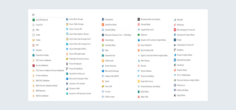
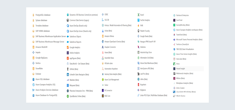
Tableau:
Target Developer Demographic
Power BI’s user interface is rooted in Microsoft’s GUI, which most users are already familiar with. This makes it a very user-friendly and intuitive tool, and hence it can be used by both experienced as well as inexperienced users very easily.
Tableau, however, is generally used by analysts and experienced users to generate insights from the data, as its user interface is tougher to grasp for a beginner.
Data Capacity
In Power BI, a maximum of 10GB of data can be stored in each workspace or group. However, if the size of the data exceeds 10GB, it may be stored on the cloud, i.e., Azure or Power BI can cherry-pick and fetch data from the local database without actually importing it as a whole.
On the contrary, Tableau uses a columnar-based architecture, which stores only the unique values for each column. This allows users to access billions of rows. The ‘extract’ feature in Tableau also helps to store subsets of the complete data, which reduces the file size and speeds up the dashboard as well.
Data Preprocessing
Power BI comes with a very powerful and effective tool called the Power Query Editor, which takes care of almost all data pre-processing needs of the user. Power Query Editor is included within the Power BI Desktop, and it allows us to connect to one or more data sources, as well as to modify and transform the data. We may tailor the data to our needs, make it more useful, and then import the model into the Power BI Desktop.
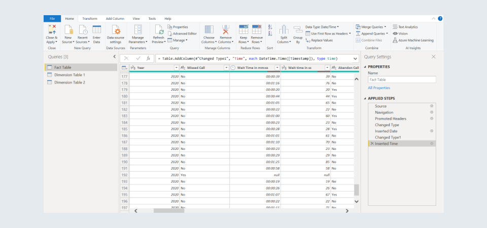
Tableau is mostly intended for data that has been pre-processed. Aside from a few fundamental data transformation functions like changing data formats and splitting columns, there isn't much that can be done in terms of data preprocessing. Tableau Prep is a tool that can be used for pre-processing and transformations of large amounts of data. However, it requires the Creator License of Tableau, which can end up becoming a more expensive option.
Visualizations
- Power BI provides a drag-and-drop capability to add elements to the dashboard which makes the developer’s experience more intuitive.
- It provides features that make data visually engaging and offers a wide variety of detailed and appealing visualizations to create dashboards and reports.
- Also, one can ask questions about the data using the Q&A feature in Power BI Service, and it will return meaningful insights obtained from it.
- Power BI has a limit of 3500 data points when drilling down to datasets for analysis. This means that many visuals can’t display large amounts of data if the data model size exceeds 250MB.
- Tableau can convert queries into visualizations, identify trends, and recognize opportunities. It even provides real-time insights through interactive visualizations using the Ask Data functionality.
- Tableau requires no prior knowledge to use because it has built-in table computations for creating reports and dashboards. In Tableau, visualizations follow a more streamlined and tidy approach and advanced visualizations are a lot better than in PowerBI.
- Tableau does not have any restrictions on the number of data points used for analysis.
Programming Support
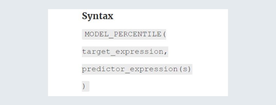
Power BI allows the use of Data Analysis Expression (DAX) for the analysis of data, and the Power Query Formula Language (M) for data manipulation and data modeling. Using Microsoft revolution analytics, Power BI Desktop can also connect to the R and Python programming languages, and run scripts of both languages.
A simple example of a measure in Power BI can be given as:

The Tableau Software Development Kit may be implemented in any of the following programming languages: C, C++, Java, or Python.
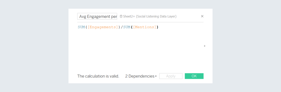
Tableau integrates with the R language considerably better than Power BI. One may create far more powerful visualizations by connecting to these programming languages
The aforementioned measure in Tableau can be written as:
Machine Learning Capability
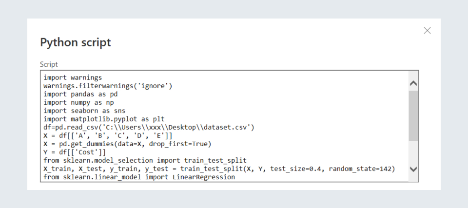
Power BI is capable of running Python and R scripts that include Machine Learning algorithms for the prediction of data.
Power BI also benefits from Microsoft's business analytics, which comprises platforms like Azure Machine Learning, SQL Server-based Analysis Services, real-time data streaming, and several Azure databases. It aids in the comprehension of data as well as the analysis of trends and patterns.
Tableau is compatible with the Python machine learning features. This enables us to deploy machine learning algorithms on the datasets and forecast data.

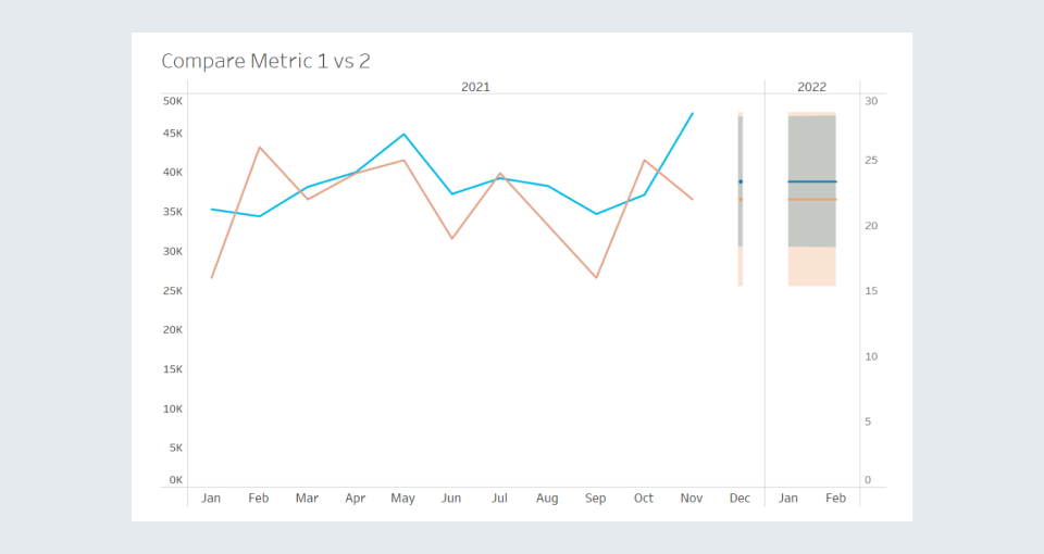
Both Tableau and Power BI also have in-visualization forecasting capabilities, meaning they can instantaneously predict and display data within a visual, by automatically choosing the best-suited predictive model for that data.
In the visual given below, the continuous lines depict the training data, while the shaded region depicts the forecasted values.
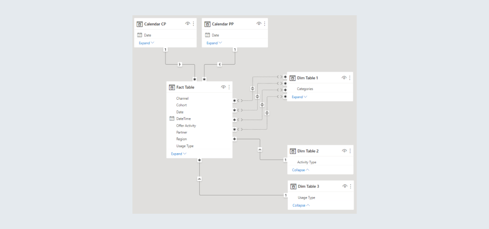
Multi-Fact Tables
In Power BI, it is quite easy to build data models with multiple fact tables, which may be related to multiple dimension tables.
This is shown below:
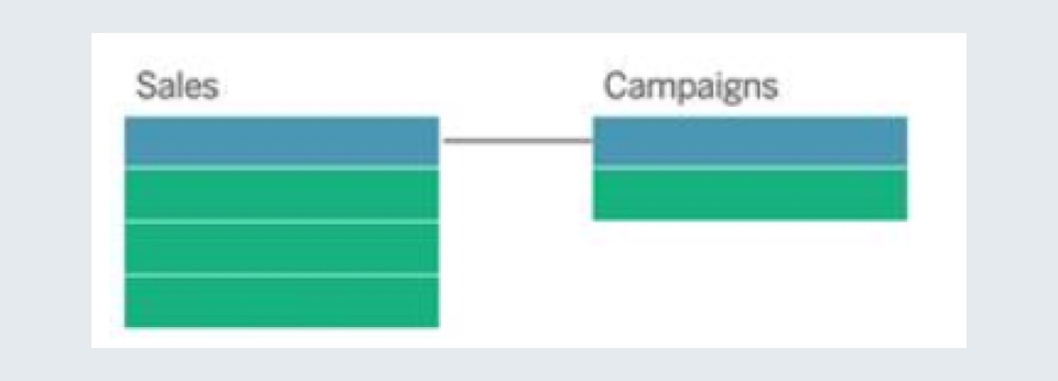
However, in Tableau, if we have multiple fact tables, then they can not be connected to more than one dimension table.
For example, in Customer 360-like analyses, you may bring together two or more fact tables to analyze a shared dimension. These fact tables may be at a different level of detail from the dimension table or one another, and they can also have a many-to-many relationship with the dimension table.
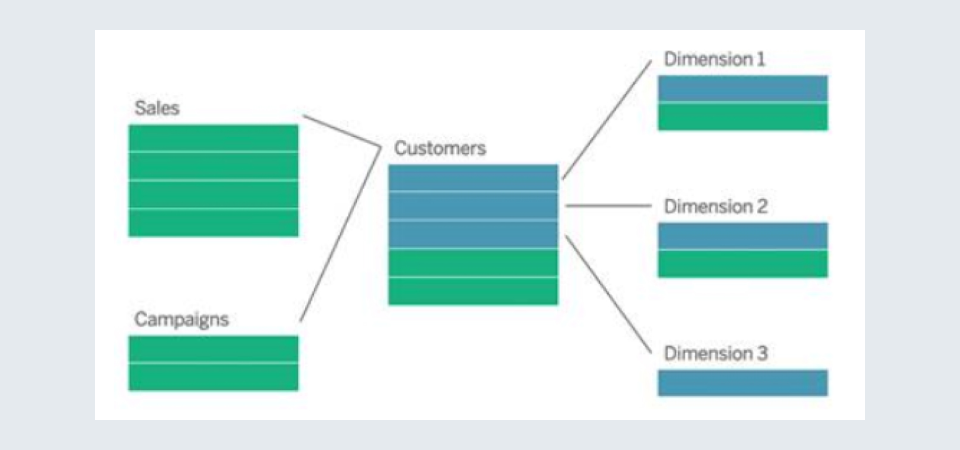
However, if there is no shared dimension table to link the fact tables together, we can create one dynamically using custom SQL or by creating joins or unions of other dimension tables.
Two fact tables can even be directly related to each other based on a shared dimension. This form of analysis works well when one of the fact tables has a superset of the common dimension.
Relationships with Multiple Fields
In the tabular model of Power BI, we are allowed to have only one relationship between two tables, i.e., we can have relationships between two tables based on only a single field. If we need to form a relationship based on multiple fields, then we need to concatenate or merge all the required fields into a single column and then use that as the field to form the relation.
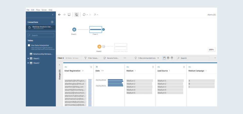
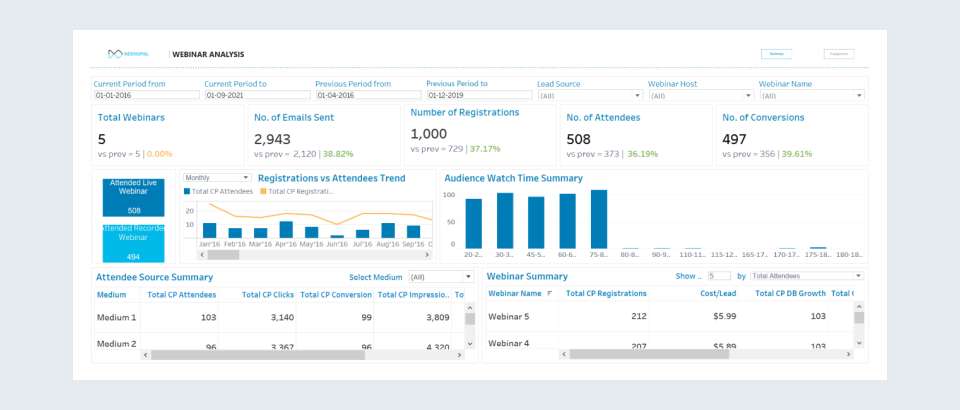
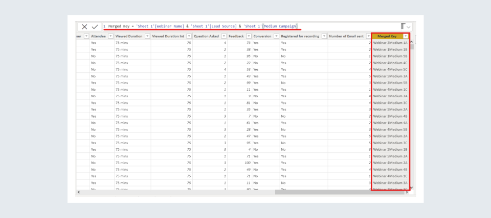
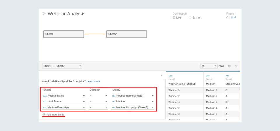
For example, let us take a Webinar Analysis dashboard of a company, which reports on the performance of the webinars organized by the company. In its data model, we have two datasheets, Sheet1 and Sheet2, which need to be related based on 3 fields.
In Power BI, we will need to merge these three columns in both sheets to get a single field in both, on which we can relate both tables.
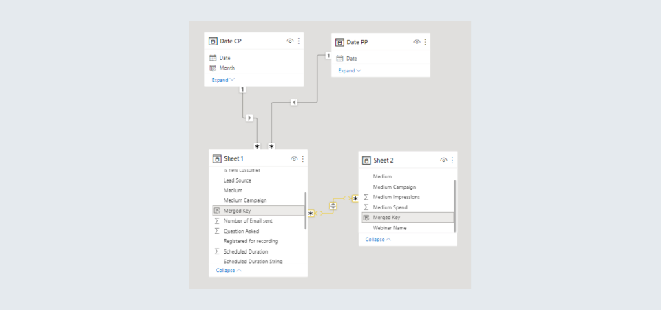
However, Tableau allows us to form a relationship between two tables based on multiple fields, which makes data modeling easier for the developer and helps in avoiding extra memory consumption, which comes along with forming a concatenated column, as in Power BI.
Active and Inactive Relationships
As mentioned above, Power BI doesn’t allow us to create a relationship between two tables based on more than one field, however, it does possess a very useful feature, i.e., the concept of Active and Inactive Relationships. In addition to the one relationship we can form based on a single column, Power BI allows us to have multiple inactive relationships between two tables. An inactive relationship remains dormant unless called upon by the USERELATIONSHIP() function in a measure or calculated field, upon which this relationship overrides the Active Relationship, and comes into play.
This is a very valuable feature because by using inactive relationships, we can create measures based on various relationships between the same two tables.
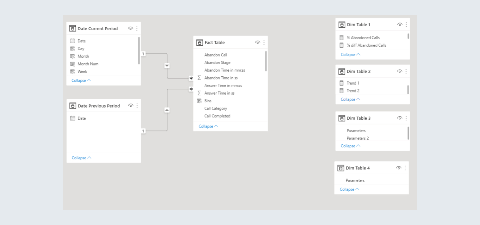
Let us take the example of an Offer Analysis Dashboard which essentially reports how the offers issued by a company on their product were received by the customers.
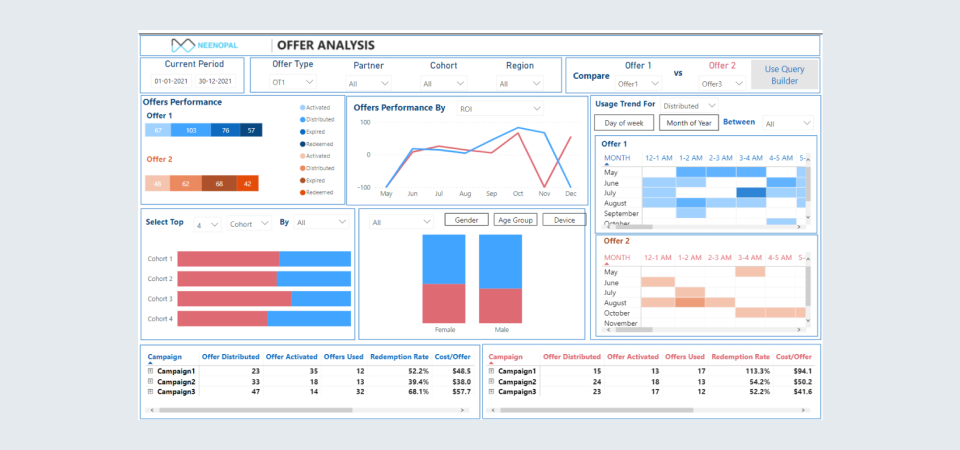
In the data model, we see several inactive relationships between the Fact Table and one of the dimension tables, Dim Table 1.
Measures can be created based on these inactive relationships by using the USERELATIONSHIP() function, as can be seen below:
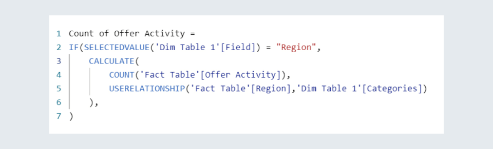
This feature of Inactive Relationships is not available in Tableau.
Flexibility in Writing Measures
Power BI offers developers the utmost flexibility whilst writing measures. This means that a measure that exists in Table A can compute values using columns of Tables B and C, and that measure can then be used in a visual alongside the axis coming from the column of another table, Table D.
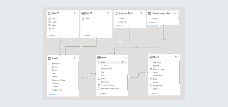
For example, let us take a look at a Call Center Analysis dashboard of a company.
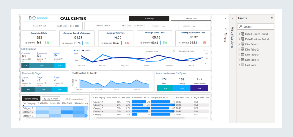
Focusing on the visual that compares the monthly trend of any two parameters selected by the user, we see that its axis, i.e., Month, comes from the Date Current Period Table, while the Values and Secondary Values come from the dimension table Dim Table 2.
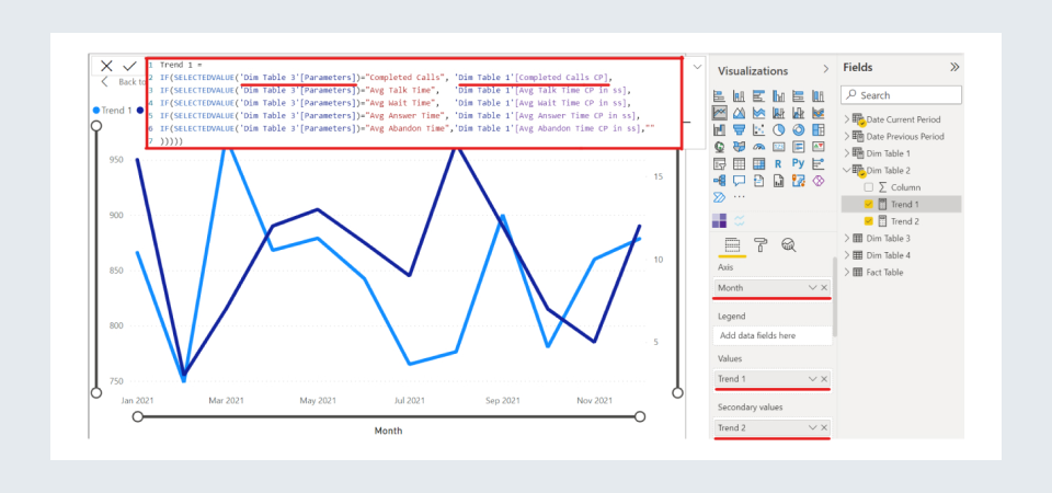
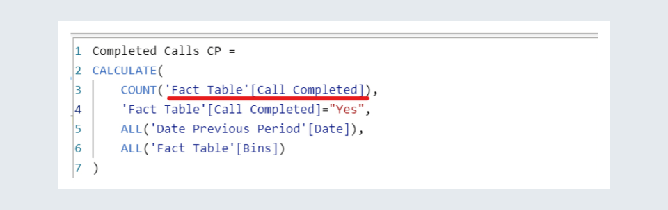
Now. looking at the measure, Trend 1, we see that it contains computes its results using measures from Dim Table 1 and Dim Table 3, which further use values from the Fact Table as shown below:
However, looking at the data model of the dashboard, we observe that the dimension tables have relationships with neither the Fact Table nor the date tables. Even so, we can form our measures and place them along the axis coming from the Date Current Period table.
This kind of versatility in making measures is not offered by Tableau wherein this process is a bit more rigid, and relationships between tables are required while using their dimensions in a measure.
Top/Bottom N Slicers
In Power BI, there is no built-in feature that allows us to create a ‘Top/Bottom N’ slicer for a visual. To accomplish this, we need to follow a series of steps, which can become cumbersome for the developer.
However, Tableau offers a much simpler way of including this slicer, by having an in-built feature in which we can simply enter our requirements for the slicer, and add it to the dashboard.
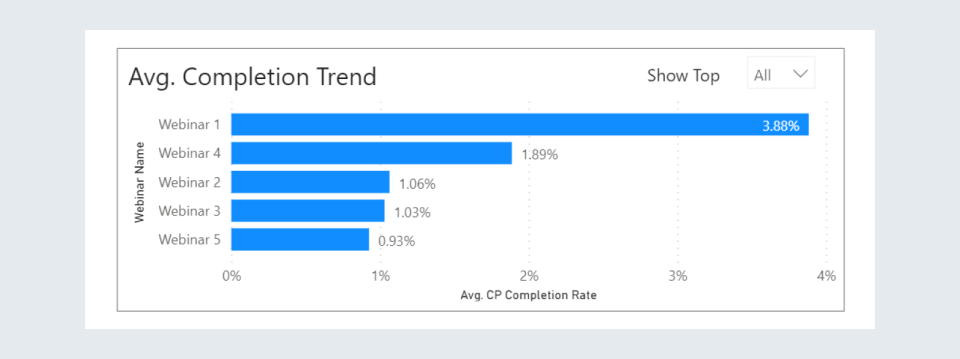
Let us see how a Top 5 filter can be implemented in Power BI by taking the following visual from the Webinar Analysis dashboard:
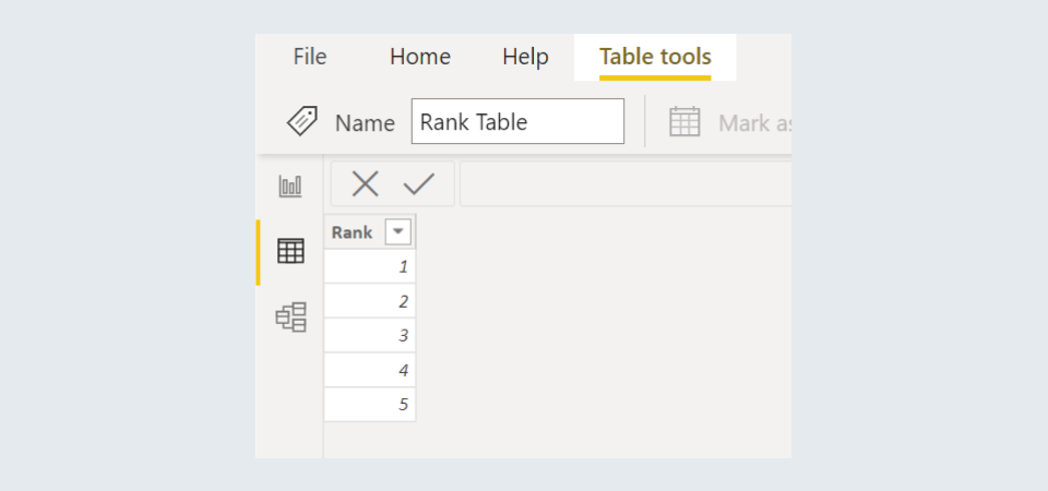
Step 1: Create a table containing all possible ranks, like 1 to 5
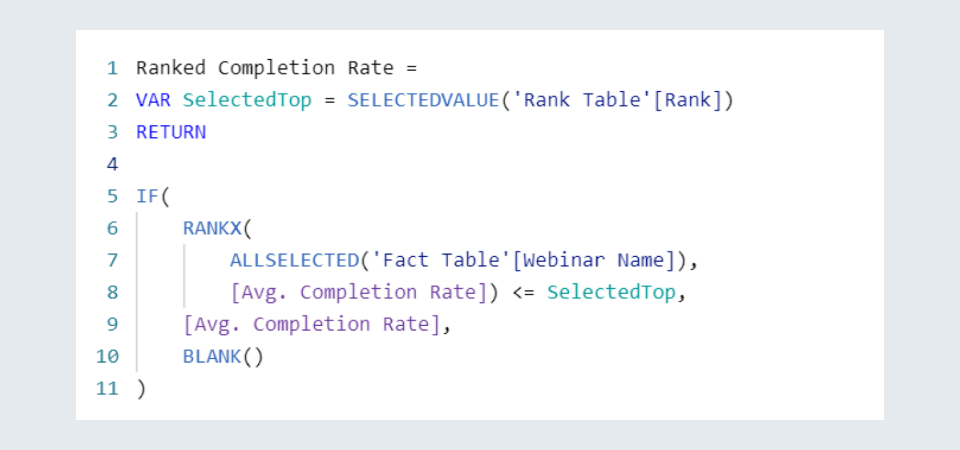
Step 2: Create a measure that ranks all elements based on a particular parameter, and returns only those, whose rank is less than the one chosen by the user. In this case, we rank our webinars based on the value of their Avg. Completion Rate
Step 3: We can use this measure as the value in our bar chart to obtain a well-functioning visual.
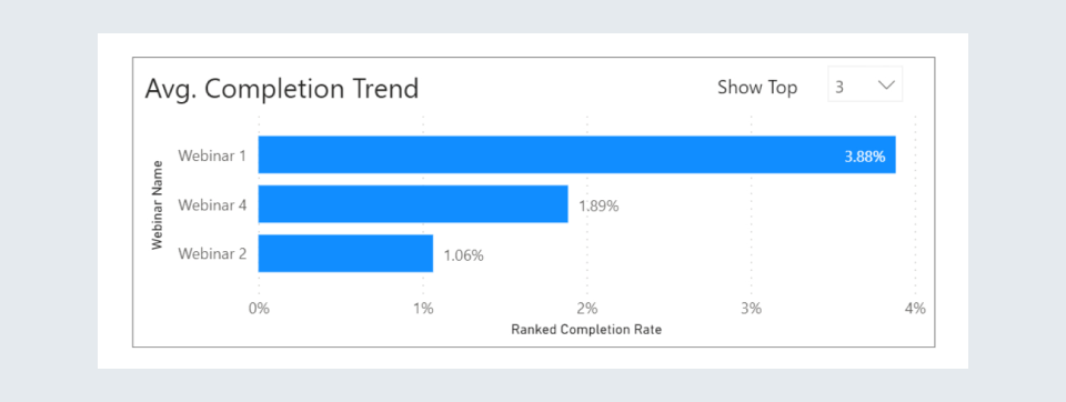
This is just one method for implementing this, there can be many workarounds for different user requirements. This method can become inconvenient for the developer especially when the complexity of such slicers increases.
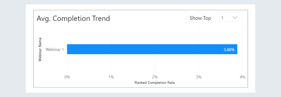
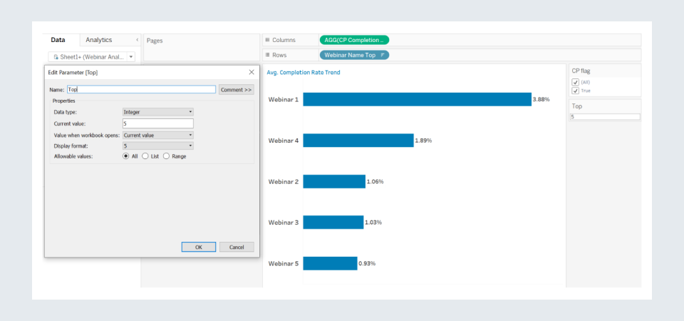
However, in Tableau, there is a built-in feature to implement these Top/Bottom N slicers, which makes the process quicker and simpler.
We can simply create a parameter and add in our required values of Data Type, Current Value, etc.
Dynamically change a visualization based on Dimension selection
In Power BI, changing the dimension (columns, axis, etc.) of a visual based on the dimension selected by the user also requires a series of steps to be performed by the developer.
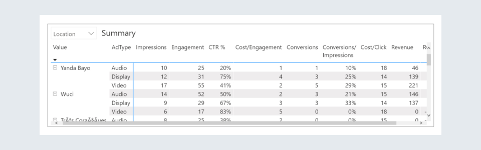
Let us understand how to implement this with the help of a Display Ads Analysis dashboard.
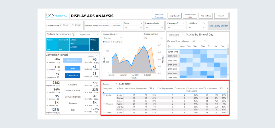
Here, we focus on the table marked with red. It can show either the Partner Summary or the Location Summary, based on the option selected by the user. We must note that Partner and Location are both dimensions in the visual, i.e., all values in other columns like Impressions, Engagement, etc., are given with respect to them.
Step 1: Open the Power Query Editor and duplicate the table in which all your possible dimensions exist. In this dashboard, the table in which the Partner and Location columns lie is the ‘Date level data.’
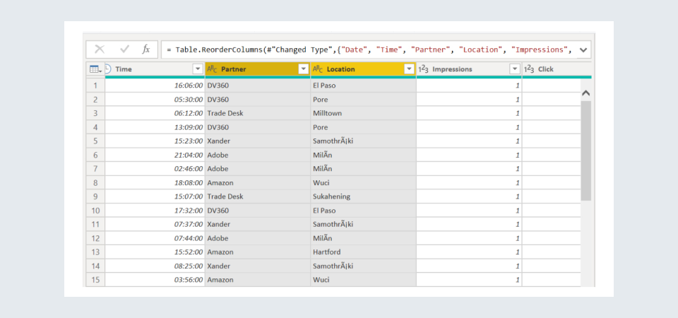
Step 2: Select all those dimensions that would be presented as an option to the user, and select Unpivot Columns.
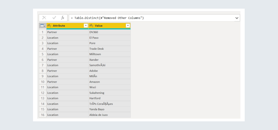
Step 3: Click on Remove Other Columns and then click on Remove Duplicates, after which we would be left with the following table, named ‘Dynamic Dimensions Table’:
Step 4: Form inactive relationships between the Value field and their parent columns in the fact table, i.e., Date level data. This means we need to make the following inactive relationships:
‘Dynamic Dimensions Table’[Value] - ‘Date level data’[Partner]
‘Dynamic Dimensions Table’[Value] - ‘Date level data’[Location]
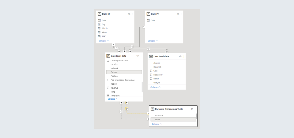
Step 5: Put the Attribute column of the Dynamic Dimensions Table in the slicer, and the Value as the dimension or row for the visual.
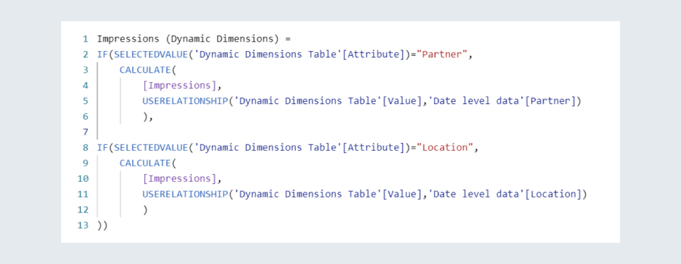
Step 6: Now, we simply need to form the measures for the values required to be put in the visual. These can be created by using the USERELATIONSHIP() function. For example, a measure for calculating Impressions can be written as:
We will get our required visual after executing these steps.
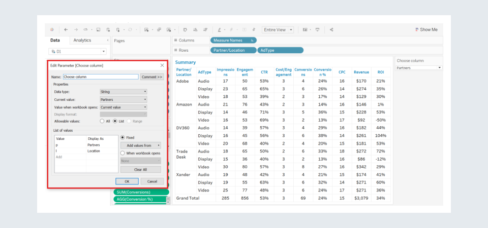
The implementation of the same in Tableau is much simpler and can be done by creating a parameter, and filling in the required fields, as shown:
Dynamic Addition/Removal of Visuals
Let us understand this with the help of an example. The figure below shows the Competitor Analysis screen of the Social Listening dashboard of a company. Here, we can choose the competitors for which we want to see the comparisons.
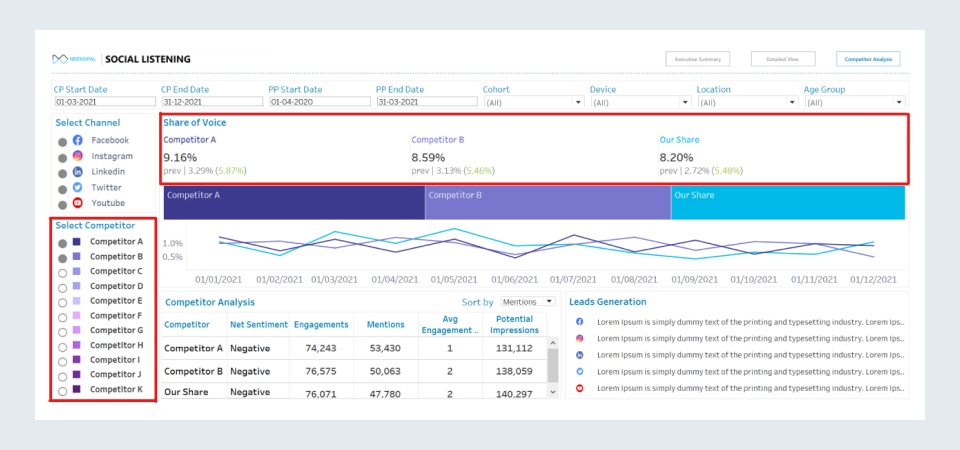
Focussing on the ‘Share of Voice’ visual, we see that it is a group of various KPI cards for each competitor. Now, if we select more competitors, the visual will change accordingly:
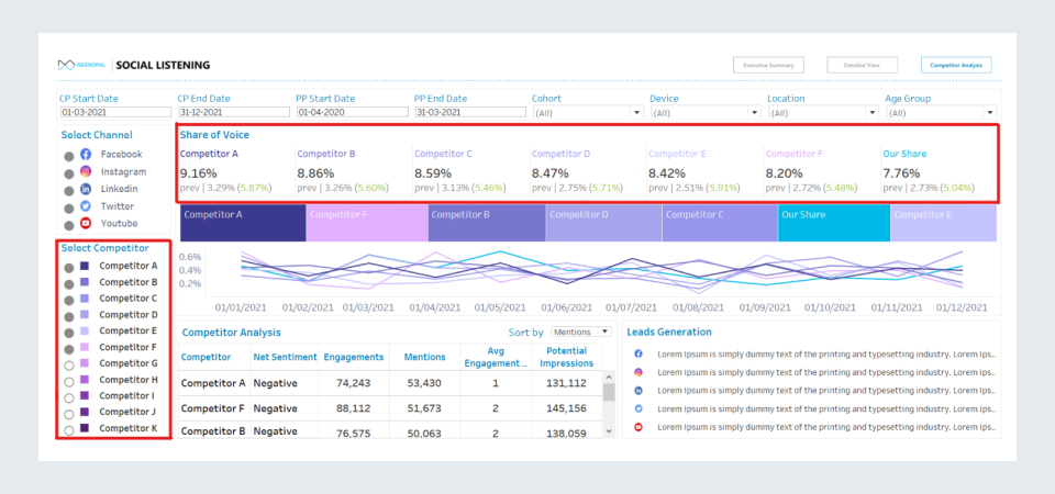
Even if we didn’t have a slicer for competitor selection and there was a change in the number of competitors in the data source, the visual would automatically adjust itself accordingly.
However, in Power BI, such dynamic changes in visuals are not possible, and such KPI cards would remain static and would not change with the competitors selected by the user through the slicer or even because of a change in the number of competitors in the data source.
Key Takeaways:
Reasons to choose Power BI:
- Performance to cost ratio is quite good, i.e., it is cost-effective
- Intuitive user interface; easy-to-use
- Has good machine learning capabilities
- Excellent Excel integration and DAX programming support
- Extremely powerful data preprocessor, i.e., Power Query Editor
- Provides high flexibility in writing measures
- Allows multiple fact tables to form relationships with more than one dimension tables
- Possesses the unique feature of inactive relationships
Reasons to choose Tableau:
- Great performance, can handle huge quantities of data with ease
- Enormous data capacity, can access billions of rows
- Provides connectivity to a larger variety of data sources
- A huge variety of visualizations, and a better quality of advanced visualizations
- Can connect to Python for Machine Learning operations
- Relationships between tables can be formed based on multiple fields
- Easy to implement Top or Bottom N slicers
- Allows to easily change the dimension of a visual, based on user selection
- Simple dynamic addition/removal of visuals from the report
Power BI
1. Dynamically change a visualization based on Dimension selection:
May 2022 release of Power BI allows users to create Field Parameters to implement dynamically changing dimensions in a visual.
For more information, click here. https://powerbi.microsoft.com/en-us/blog/power-bi-may-2022-feature-summary/
Tableau
1. Multiple Fact Tables:
A new feature of Shared Dimensions is being introduced this year, allowing users to relate multiple fact tables across multiple shared dimensions in Tableau to handle more complex data models.
For more information, click here. https://www.tableau.com/about/blog/2022/5/power-your-analytics-advantage-tableau-product-innovations