
Dashboards represents valuable information and help companies to make crucial decisions for better performance
Dashboards are extremely important in today's world. While a few charts or tables may still be used to represent the data, a good dashboard design will help the user get the information they need. A good dashboard is easy to use, accessible and accomplishes its goal. To create a good dashboard, one does not need to be an expert designer.
Here are 10 simple practices for designing efficient dashboards
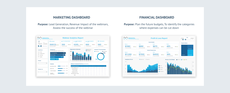
Specify the dashboard's purpose and users
Someone, such as a sales representative or an executive manager, will utilize a dashboard to visualize data. Therefore it’s necessary to understand their needs and expectations. This helps to better define the purpose of the dashboard. There are many types of dashboards such as operational, analytical, and strategic. Based on the user, one can use a specific type or a combination.
Display Top N List With Grand Total Of All Elements And Contribution Percentage
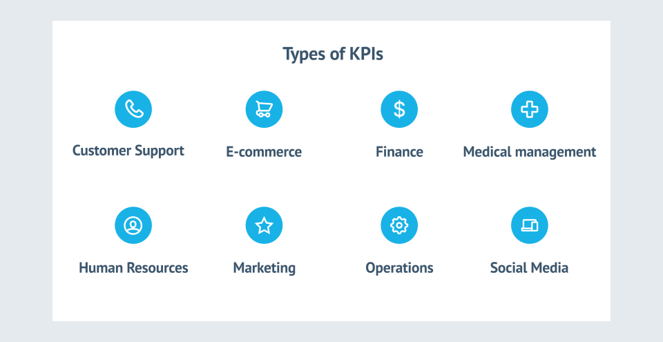
Key performance indicators (KPIs) and metrics form the backbone of a dashboard. The important KPIs should be included depending on the objective and user requirements. A sales manager might be interested not only in the sales target but would also like to compare the performance of his sales representatives that may involve different metrics. The dashboard should show all these KPIs together. However, including so many KPIs may cause the user to become overwhelmed with information. Therefore, decide what to prioritize.
Select appropriate visuals to represent the metrics
Assign the type of graphic to each measure when you've completed the above list of KPIs. Let's say one is creating a dashboard for case analysis. The following metrics are required: Cases by channel, no. of open cases by status, percentage of open cases. Now we assign a visual to each one:
- Cases by channel: a rank chart (horizontal columns)
- No. of open cases by status: a treemap or a pie chart
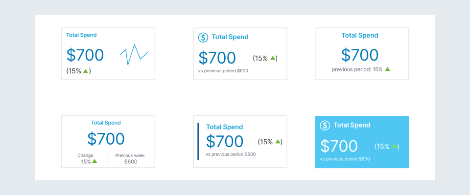
- Percentage of open cases: a card
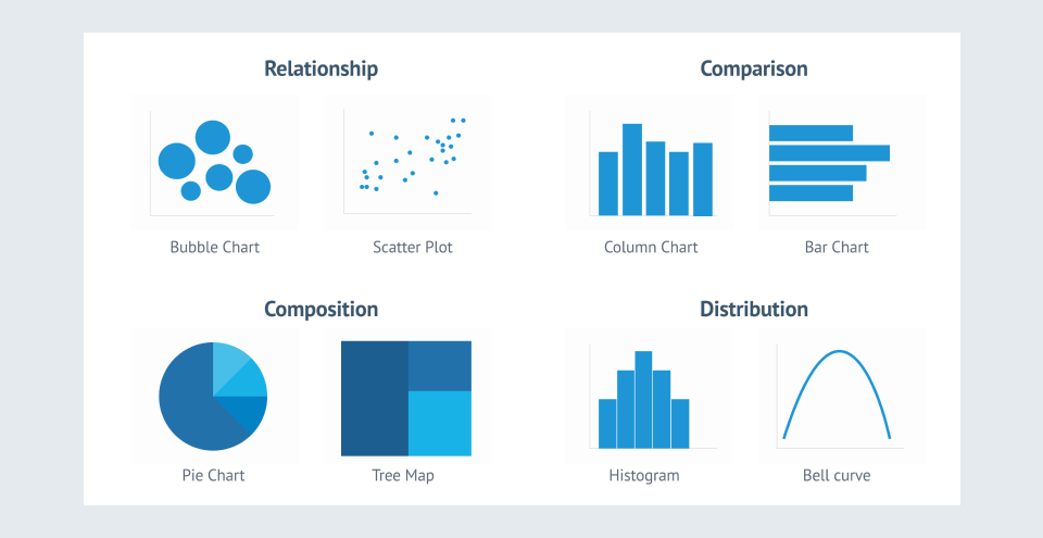
Understand the type of information that needs to be conveyed and decide the chart accordingly. Here is a small list of charts suitable for each need:
- Relationship: Scatter plot or bubble plot
- Comparison: Column chart, bar chart
- Composition: pie chart, treemaps, donut chart
- Distribution: Histogram, Bell curve
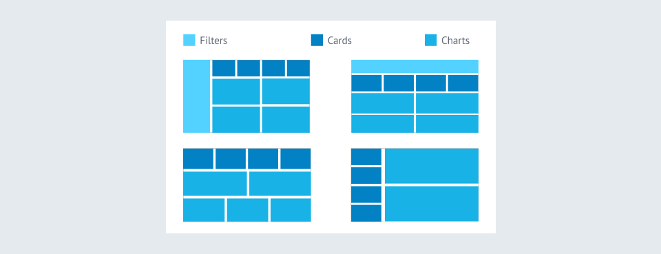
Decide the layout and hierarchy of elements
Start building a basic layout for the dashboard once it is selected which charts, cards, and filters will be included. While simply placing charts still makes it a dashboard, applying few principles adds value. The majority of individuals read from left to right, beginning at the top. As a result, the most relevant information should be presented in the upper left corner. Metrics that are related to each other, keep them closer. This eliminates the need for the user to navigate back and forth or up and down the dashboard. It makes the user experience better.
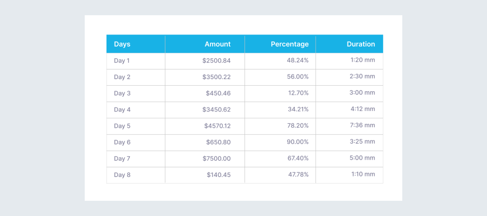
Be careful with numbers
Make sure the numbers have consistent decimal places. It's preferable to use numbers with one or two decimal places and not more. For example, if a day's income is $540.25, make sure all currency-related columns have 2 decimal places. It is sometimes preferable to round off figures. Some figures require the use of specific units. Use the symbols for these units at the appropriate place. For example, 350 dollars is written as $350 and not 350$.
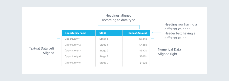
Design tables effectively
Follow the guidelines of the decimal place here too as mentioned before. Apply a different color to column headers. To separate rows, you can use either lines or zebra stripes. Zebra stripes are useful for big amounts of data since they help to avoid confusion.
Always keep in mind:
- Textual data is left aligned as we read from left to right.
- Numerical data is right-aligned as the numbers are compared with their one’s digit, then ten’s, and so on. Headers are always aligned according to the data type.
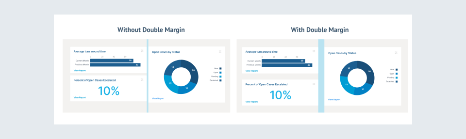
A little bit of spacing can do wonders
The empty space between the elements is called white space. It allows the eye to relax for a moment between elements. Otherwise, everything will be in a continuous flow, which will be inconvenient for the user. It also aids in better grouping and segregating the dashboard's features. To improve readability, use double margins.
Choose colors wisely
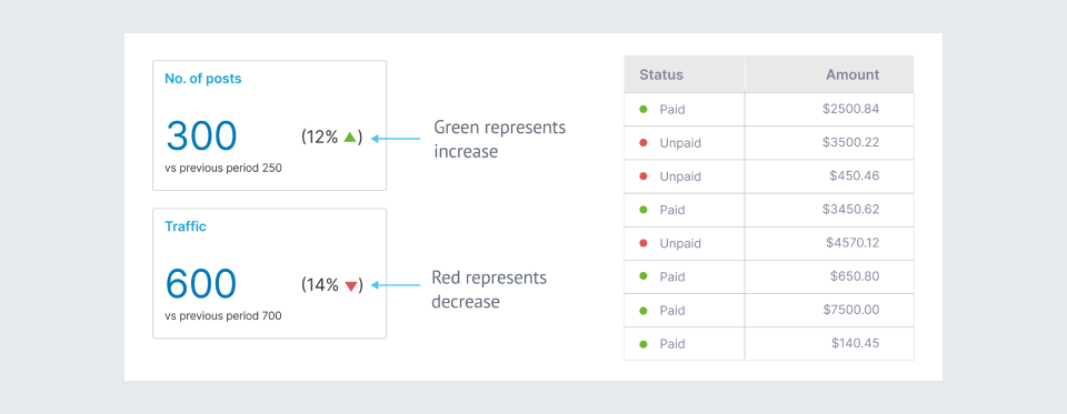
One could use their company's colors. If not, there are so many color palette generators out there. Remember to keep it simple and avoid using too many colors. Some colors have meaning associated with them for example, red represents ‘danger’ or ‘to stop’ while green represents ‘to go’. This can be utilized to show some data that needs immediate attention and can be shown in red as follows:
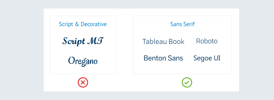
Keep it simple/minimal
A dashboard should be visually pleasing, but this does not imply that too many decorative components should be included. Use a limited number of colors. Do not use scripted or decorative fonts as shown. Fonts like Tableau Book and Benton Sans are ideal for tableau, while Segoe UI is suitable for Power BI. These visual components should not divert from the primary goal of conveying information to the users. Rather they should enhance the decision-making process. Simplicity is the key to achieve this.
Do a final check
Make sure everything is consistent throughout the dashboard. All the KPI cards should have the same size font. All the chart headings should have the same color and font size. If the color red is being used to represent a negative value in one chart, it should be utilized for the same purpose in other charts as well. Check whether the legends have been provided for the required charts. And finally, make sure everything is aligned properly.
Hope these practices help to make better dashboards.