
Introduction:
Data visualization plays a crucial role in helping organizations make sense of their data and make informed decisions. Mapping office locations and the areas they serve is one such use case, providing valuable insights into a company's footprint and enabling targeted marketing and sales efforts. In this blog, we'll dive into how to plot office locations and their service areas using the PowerBI ArcGIS plugin and Tableau.
Table of Contents:
- Data Overview
- Plotting using Tableau and It's pros and cons
- Plotting using PowerBI ArcGIS and it's pros and cons
- Plotting using PowerBI ShapeMap and its pros and cons
- Comparison and Endnotes
Data Overview:
Before we start exploring the tools to plot office locations and service areas, let's look at the sample dataset which we'll be using.
Service Area data contains the Service status for each Zip Code in the US.
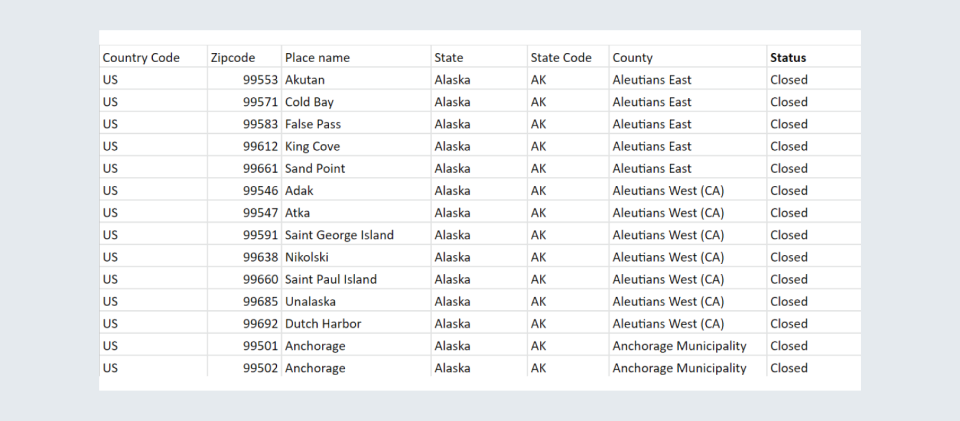
Office Location data contains the latitude and longitude information for each office.
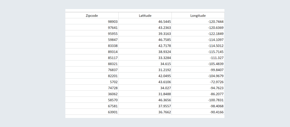
Tableau:
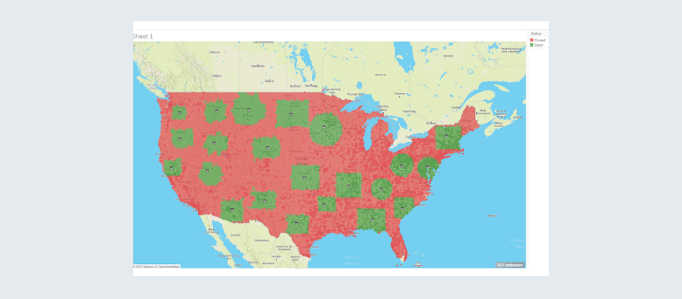
Tableau provides a variety of built-in geospatial calculations and functions to aggregate and manipulate data based on geographic locations. With the use of latitude and longitude information, Tableau can plot the office locations on a map with pinpoint accuracy. The ability to use layers in Tableau can be particularly useful for plotting office locations and their service areas, as it allows you to add multiple data sets to the same map and control the visibility of each layer independently. This makes it easy to quickly see patterns and relationships in your data and gain valuable insights into your operations.
Steps to create the plot:
- Connect both the data sources and join using Zip codes
- Drop the generated Longitude and Latitude in the column and row shelf
- Change the map background to “Outdoors”
- Change the Marks card to 'Map' and add necessary fields to the detail tab
- Add the “Status” column to the color tab
- Now, add another layer to the map by using the longitude and latitude information of the office locations to plot them on the map
- Change this new Marks card to 'shape' and select any suitable shape.
- Format the map according to your requirement
Advantages:
- Map layer gives you the option to plot multiple latitudes and longitudes on the same map.
- It gives you an interactive Map view.
- You can add any custom shape to the map.
- It does not require any extensions to be used.
Limitations:
-
None for our use case.
PowerBI:
PowerBI provides a visual interface for creating maps and integrating data, while ArcGIS is a mapping platform that provides advanced geospatial capabilities. When used together, PowerBI and ArcGIS provide a powerful solution for visualizing and analyzing geographic data. With PowerBI ArcGIS integration, you can easily plot office locations on a map using latitude and longitude information. You can also use ArcGIS to create custom map layers that show the information on the map using a variety of visualizations, including shading, coloring, and labels. Additionally, PowerBI provides a variety of built-in calculations and functions that make it easy to aggregate and manipulate data based on geographic locations.
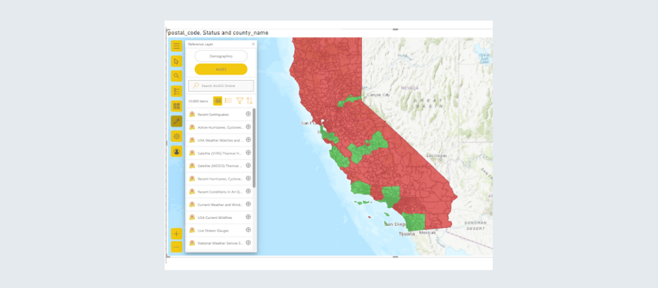
We're going to create a custom layer in ArcGIS Portal for office locations and then use it on top of the zip code area layer in PowerBI. For our use case, we’ll be plotting only for California.
Steps to create the plot:
- Connect the Service areas data in PowerBI
- Select the ArcGIS map plugin and plot the zip code areas and their respective status.
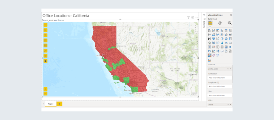
- Create the Office Locations map layer in ArcGIS online and use symbols available to depict each location on the map.
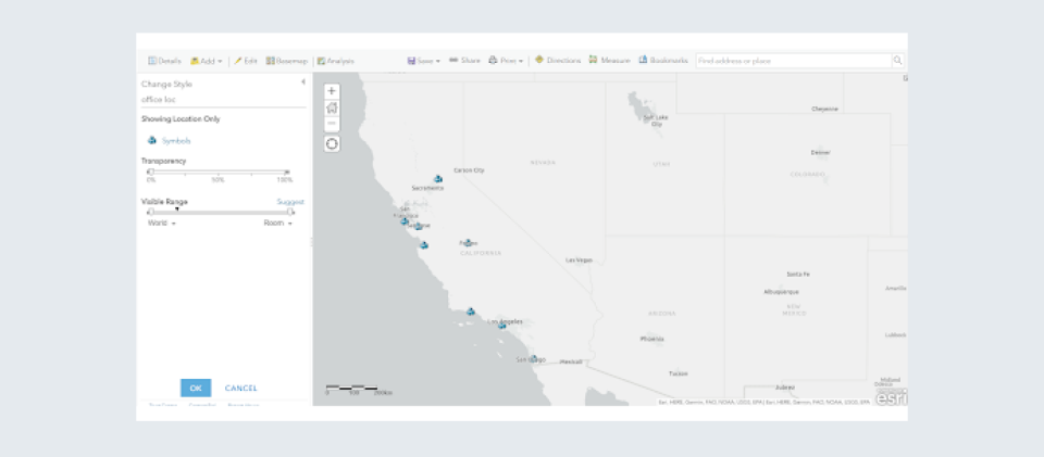
- Add this custom layer on top of the zip code areas map in PowerBI
- Modify as per the requirements.

Advantages:
- Simple integration with Power BI, just sign in to your ArcGIS account and get all your custom maps.
- Using ArcGIS online, create custom map layers on different basemap canvases such as satellite imagery, navigation map, streets map, topographic maps etc.
- Add multiple custom layers depicting different parameters on a single map in Power BI.
- You can also use layers available in ArcGIS Living Atlas to add to your Power BI maps.
Limitations:
- To create custom layers in ArcGIS online, you need a paid account.
- Limit of plotting 3500 points as a Standard user(free) or 10000 points if signed in into ArcGIS online or ArcGIS Enterprise.
Both methods effectively address our requirement, but let's take a look at one more method that can help us plot the zip code areas using a shapefile.
PowerBI ShapeMap:
This is a type of map that shows polygon shapes on the canvas with a blank background. A shape map varies with the other maps in a lot of ways including having built-in geographies and the ability to import custom shapes using the TopoJSON format.
Steps:
- Enable Shape Map in the from Preview Features options.
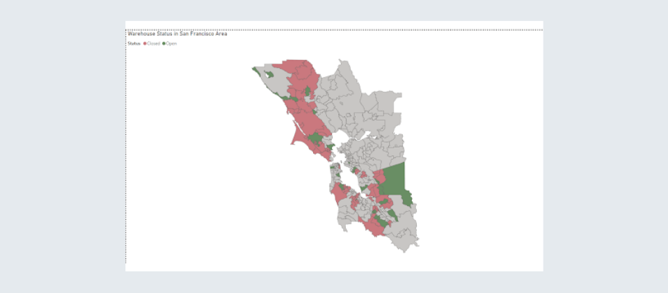
- Create a Shape map of the United States by dragging the Zipcode field to the Location shelf.
- Download the USA ZipCode shapefile online (One can get San Francisco region zip codes from MITGeoWeb).
- Convert shapefile into TopoJSON.
- Click on Add Maps in PowerBI and add the downloaded Json file.
- Drag Status into “Color saturation” shelf.
- Modify as per the requirement.
Here's the ShapeMap for San Francisco
Advantages:
- Allows custom geography.
- Allows any type of 2D shape.
Limitations:
- Still in preview mode so it can only be used in Power BI Desktop.
- No background or base map option.
- No label on the map.
- No points or lines; only renders polygon shapes.
- Not ideal for large TopoJSON files as it may load slowly.
Comparison and Endnotes:
| Tableau | PowerBI ArcGIS map | PowerBI ShapeMap | |
|---|---|---|---|
| Subscription | Required | Required for ArcGIS | Not Required |
| Data Limitations | None | Only 10000 data points in Paid subscription of ArcGIS online | None but gets very slow |
| Map Layers | Supported | Supported | Not Supported |
This article is designed to give you a brief idea about various options available for plotting office locations on a map along with the zip code areas where a particular office serves.
Thanks for reading!