
Uncover 5 PowerBI Hidden Features You Don't Want to Miss
PowerBI is an amazing tool that can help you visualize and analyze data in powerful ways. In this blog, we explore five tips and tricks to help you get the most out of PowerBI. With these tips and tricks, you can maximize PowerBI’s potential and create dynamic, interactive visuals that will wow your audience. So let’s dive in and see what it can do for you!
Create Custom KPI Cards
Custom KPI cards allow users to access the most relevant and important performance indicators for their business quickly and easily.
By creating custom KPI cards, users can easily see the performance of their business in one glance, allowing them to make data-driven decisions quickly. Additionally, custom KPI cards allow users to tailor their visuals to their specific needs, rather than relying on generic visuals.
This allows users to get the most out of their data and make the most effective decisions.
Here are the Custom KPI Cards

While there is no direct method in PowerBI to create custom KPI cards, multiple measures can be created using DAX and then formatted according to the output.
To achieve the displayed outcome, please complete the following steps:
Step 1: Create a measure using DAX that calculates the metric you want to display.
Step 2: Create a visual using a card visual.
Step 3: Select the measure you created in Step 1 as the value for the card visual.
Step 4: Customize the format of the card visual (e.g. colors, text, etc.) to create the desired KPI card.
Step 5: Group them together so that it becomes one robust unit.
Dynamic Charts
Creating dynamic charts can have a major impact on business analytics by providing a more comprehensive view of data.
For example, dynamic charts can allow businesses to compare different sets of data over time and spot meaningful trends, which can then be used to make informed decisions.
Additionally, dynamic charts can provide a more accurate representation of data, as they can be adjusted to account for seasonal changes, changes in market conditions, or other factors
Furthermore, viewing multiple fields in a chart broadens the scope of analysis, and alleviates the issue of space constraints in dashboards.
Here are Dynamic Charts
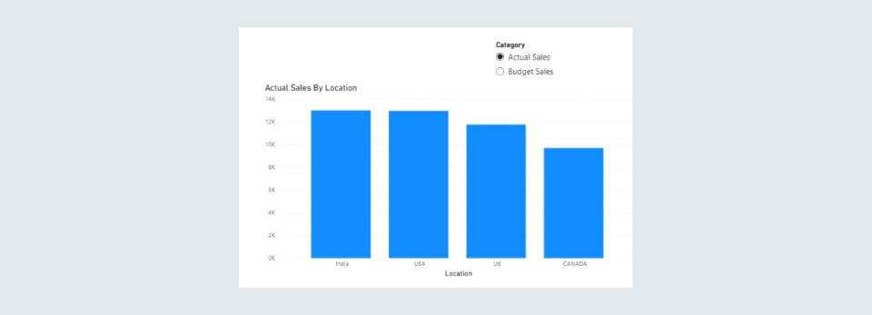
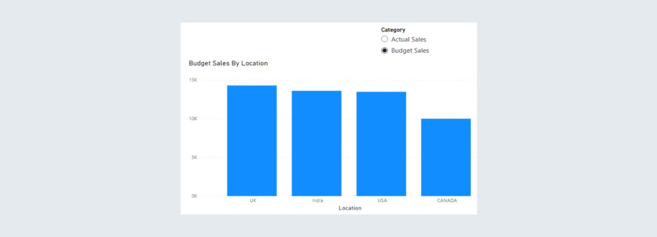
To achieve the displayed outcome, please complete the following steps:
- Create a table with the fields you want in your chart.
- Create a measure that will render the value based on the selected value of the slicer.
- Create a measure that will dynamically change the title based on the selected value of the slicer.
- Use the SWITCH() or IF() function along with the measure created in point 2 to set the title dynamically.
The above method can be done using field parameters (Note: this option is in the preview option only and will not work on Power BI Service)
Data Storytelling Using Dynamic Titles
Customizable titles in Power BI charts are important for any organization because they allow the user to identify the data in the chart quickly and easily.
The titles help to convey the data’s meaning, provide additional context, and draw attention to important data points. Customizable titles also make it easier to compare data points and create more detailed reports. This helps organizations make better decisions and save time
Additionally, custom titles can be used to help make complex data more understandable, enabling users to quickly find the information they need.
Here is the output for Data Storytelling using Dynamic Titles:
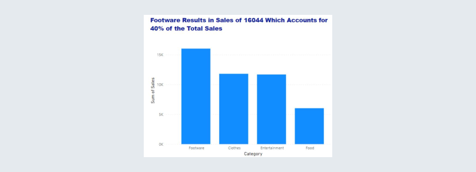
To achieve the displayed outcome, please complete the following steps:
1. Create a text output measure.
- The measure should have a format fixed.
- Numbers and Percentages should be defined with their respective formats.
- E.g. Title = [Top Category Sales] &” Sales are: “& FORMAT([Top Category Sales Qty],”General Number”) & “ which accounts for “ & FORMAT([Top Category %], “percent”)
2. Use that measure in the title section of the chart.
Play Axis
The Play Axis feature in Power BI is an incredibly powerful tool that can be used to create dynamic, visually engaging dashboards.
This feature allows users to interact with data in real time by changing the values of a single axis in a chart or graph. By changing the values of the Play Axis, users can quickly explore different scenarios and gain insights that would not be visible in a static chart or graph.
The Play Axis feature can also be used to compare different scenarios side-by-side, allowing users to quickly spot trends and make informed decisions.
Furthermore, the Play Axis feature is also useful for creating interactive presentations, allowing users to engage their audience by allowing them to interact with the data in real time.
Why Play Axis?
Play-axis can be trends in continuous data at the click of the play button without having to keep changing filters. It is a dynamic slicer that can animate the visual without any user interaction. Each data point on the axis is also manually clickable to act as a filter.
Here you can find the video for Play Axis
To achieve the displayed outcome, please complete the following steps:
- Go to Visualizations -> Get More Visuals
- It is a dynamic slicer that can animate the visual without any user interaction.
- Each data point on the axis is also manually clickable to act as a filter.
Using Window Functions to draw important Insights.
- Window functions in DAX can be used in a variety of business use cases, such as analyzing customer behavior, understanding market trends, and forecasting performance
- For example, in customer analytics, window functions can be used to calculate customer lifetime value, customer segmentation, customer churn, and customer engagement.
- In market analytics, window functions can be used to calculate market share, market growth, market maturity, and market trends.
- In forecasting performance, window functions can be used to create time series analysis, trend analysis, and predictive analysis.
- All of these window functions can provide insights into customer, market, and performance data to help businesses make better decisions.
Here is one of the outputs that you can achieve using the window functions.

To achieve the displayed outcome, please complete the following steps:
- Create a measure using the latest available window function.
- Use the logic according to the business requirements.
- Add Color-based logic according to specific custom needs.
Here, we used offset that was recently added in Dec 2022 addition of Power BI. The December 2022 release of Power BI Desktop includes three new DAX functions: OFFSET, INDEX, and WINDOW.
They are collectively called window functions because they are closely related to SQL window functions, a powerful feature of the SQL language that allows users to perform calculations on a set of rows that are related to the current row.
In conclusion, Power BI is a powerful tool that can help you visualize, analyze, and present data in an easy-to-understand way. By following the tips and tricks we have discussed, you can get the most out of Power BI and really make the most of your data. With Power BI, the possibilities are truly endless, so get creative and explore what it can do for you!