
What is CRM analytics?
CRM Analytics, formerly Tableau CRM, is a cloud-based platform for combining data from multiple sources, creating interactive visualizations of that data, and sharing those visualizations across applications. CRM Analytics is a better way to provide information to business users so that they can understand and respond to the information change.
CRM Analytics dashboards are similar to those available with native Salesforce dashboards as they consist of charts, metrics and tables that help provide insights into your data. That's where the similarities end, however, because Tableau CRM dashboards are so much more powerful. You can tell a story with your data and have additional features like interactions, facets and filters that help your team to search, group, and even customize the data to their needs.
Why do you need CRM Analytics?
"Why should I use CRM analytics when I already have basic Salesforce reports and dashboards?" is one of the most common questions I hear when I talk about CRM Analytics (Einstein Analytics).
You will never replace Salesforce reports and dashboards. The built-in analytics feature is powerful, flexible, and easy to set up and learn. It can address many organizational needs upfront, and analysts can achieve excellent business outcomes with this tool. Salesforce reports and dashboards are still relevant, helpful, and often the go-to options for a quick win.
But Salesforce Analytics is one tool, while CRMA is a platform.
CRMA provides a robust, adaptable, and scalable pre-built analytics solution for Salesforce. It provides all Salesforce users with contextual, intelligent, and achievable information in the CRM workflow. This results in increased corporate productivity, better adoption of Salesforce and an improved user experience. Deep integration into Salesforce workflows translates into powerful process intelligence unmatched by any other platform.
Key Elements of a CRM Analytics Dashboard
The dashboard is for more than just reading. It is used to have a conversation based on one or more records important to your business. Don't just look at the pictures — use dashboard tools to explore the data that matters to you. Go ahead, click and discover! Read the Salesforce CRM Analytics dashboard interactively by clicking on the items that appear. Each item is an image of a real-time filtered query.
Key Performance Indicators
A single number, a key performance indicator, generally best measures information. Some numeric items can be filtered based on selections in charts and filters. For example, in a donut chart showing the number of opportunities for each stage, click the donut to focus on the number of opportunities for a specific stage. Note that the number changes depending on the portion you choose.
Charts
A wide variety of charts present data from different angles. Many parts of the chart are interactive. For example, clicking the bar filters the query the bar chart represents. Your version changes other values on this chart, values on other charts, and how numbers are displayed.
Tables
The record-level details are presented in a table. For instance, a table can display opportunity-specific details, while a chart can display a performance overview for sales reps. Tables can be sorted to display the top and bottom records. To calculate the numbers based on already-existing data, you can add calculated columns in tables.
Dashboard Examples
Campaign Dashboard
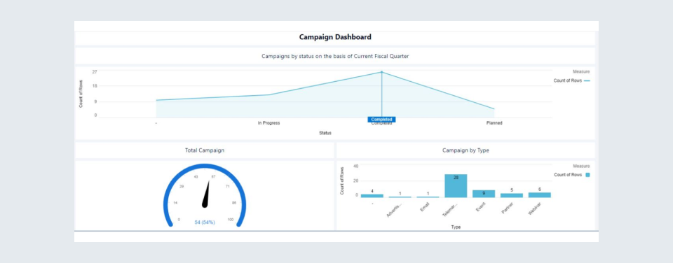
Overview
- Through the Campaign by Status dashboard, we can easily analyze the number of campaigns depending on their status for the current fiscal quarter year.
- The Total Campaign dashboard shows the total number of campaigns we have.
- The Campaign by Type dashboard is used to overview the count of campaign types, for example, email, event, and webinars.
Contact Dashboard
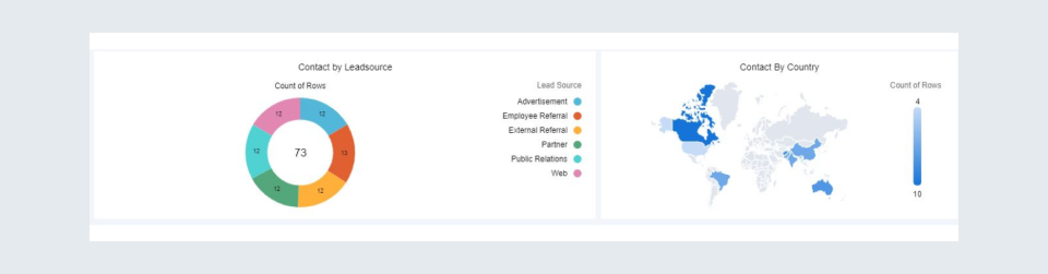
Overview
- Contact by Lead Source dashboard is used to visualize the number of contacts based on their lead source type.
- Contact by Mailing Country gives us the overview of contacts depending on their Mailing Country, so we can easily recognize the count of particular country contacts.
Opportunity Dashboard
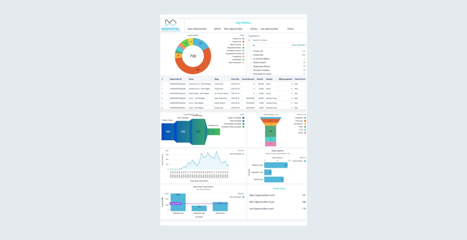
Overview
- In this, we showed the revenue and the count of open, closed, and won deals.
- We analyzed several opportunities in each stage.
- We analyzed several opportunities based on the campaign source.
- We analyzed the lost deals and their reasons for improving the organization's success rate.
- We analyzed the revenue based on the deal's close date.
- We analyzed the sales rep performance based on the count of open deals they are handling now.
- We analyzed the total revenue generated by each sales rep based on their won deals.
- We visualize the count of open, won and lost deals.