“Data is the new oil? No, data is the new soil.” – David McCandless
In this data-driven era where we all find ourselves encompassed by an enormous swarm of data, the power lies in the hands of the people who can understand and derive meaning from it. Microsoft’s Power BI is an immensely powerful data visualization and business intelligence tool with its simple, streamlined, and powerful structure making it a popular choice for thousands of individuals and organizations worldwide to aggregate, analyze, visualize, and share their data. In this blog, we will deep dive and explore some of the most interesting features of Power BI, which can help enhance any dashboard!
Artificial Intelligence:
Power BI integrates Artificial Intelligence with Business Intelligence, by providing visuals such as ‘ Quick Insights’, which automatically helps identify trends in data, and the ‘Q&A’ feature, which allows business users to obtain answers by simply asking questions.
The Q&A Visual
As can be seen in the “Q&A” visual shown below, the user asks a question,
“What is the most profitable month?”
The visual correctly mentions “January” and “March” as the most profitable (in terms of the sales made). Similar questions can be asked, and various performance indicators can be defined. The visual can be left in a ‘Q&A state’, allowing the user to ask questions. Else, if a certain visual which was created by asking a question, needs to be retained, it can be converted into a standard visual.
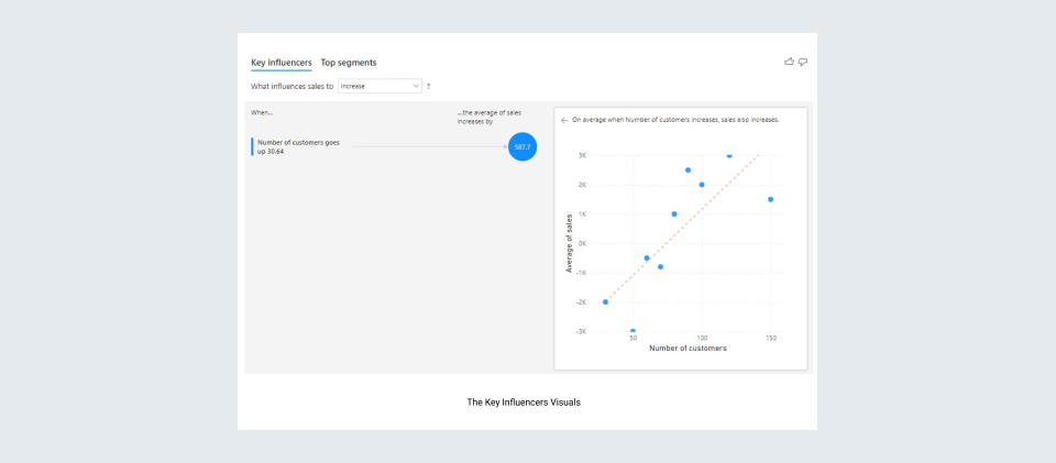
Key Influencers
One of the earliest AI features introduced by Microsoft in Power BI, the “Key influencers” visual, understand, and display the key factors and trends influencing a specific metric, using logistic regression. The visual takes a parameter ‘analyze’, which is to be explained using other parameters which can be given in the ‘explain by’ field.
The following visual shows that the sales increase with the increase in the number of customers in a month.
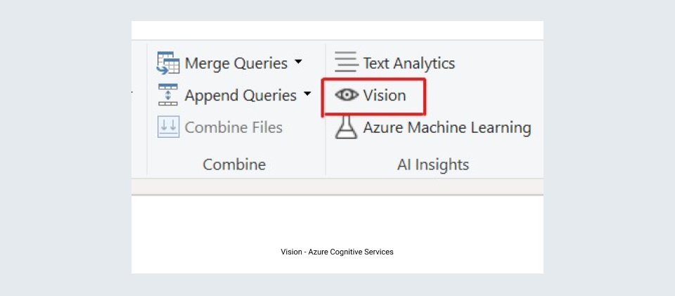
Azure Cognitive Services
Azure Cognitive Services are powerful machine learning models that have been pre-trained for intelligent applications. These models can be used by analysts to extract information from photos using image detection.
More than 2,000 recognized items, living beings, scenery, and actions are used to generate tags in the Tag Images function. Computer Vision algorithms generate tags based on the objects, live beings, and actions identified in an image after an image is uploaded or an image URL is specified. Tagging comprises the surroundings (indoor or outdoor), furniture, equipment, plants, animals, accessories, gadgets, and so forth, in addition to the main topic, such as a person in the front.
As input, this function requires an image URL or an abase-64 column, and this feature is currently available in English, Spanish, Japanese, Portuguese, and Chinese.

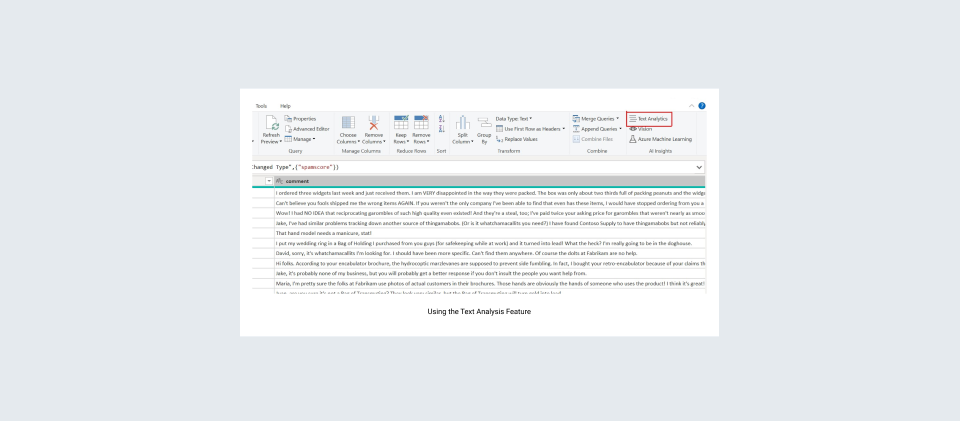
Also, customer feedback, for example, can be examined for positive and negative sentiment as well as important terms retrieved. End users can effortlessly consume all of these AI enhancements through interactive Power BI reports.
One such example of how text analytics is applied in Power BI is of a movie theater chain spread across various regions. By monitoring the sentiment of customer reviews and tweets, the organization leverages Power BI AI capabilities to learn how they may improve their visitor experience. They structure and analyze all customer feedback using text analytics in Power BI, which enables them to rate the sentiment of the visitors' reviews without having to engage in data science.
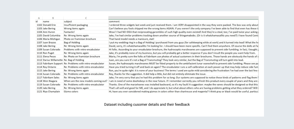
Consider the following dataset which includes the customer details and their feedback.
Using the Text Analytics feature of Power BI, we can perform language detection, keyphrase extraction, and Sentiment scoring.
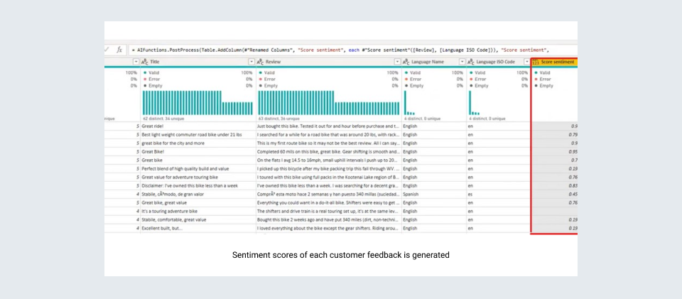
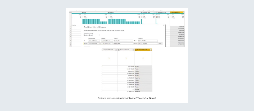
Using the feedback column in data, we calculate the sentiment scores of each customer feedback, and by defining conditions, we categorize them into different categories, ‘Positive’, ‘Negative’ and ‘Neutral’.
Azure Machine Learning
Azure Machine Learning provides a robust environment for developing machine learning models by data scientists. Analysts may now readily share and use these models. Analysts can collaborate with data scientists, and integrate these model insights in their reports. With the AutoML feature, business analysts can now create ML models without extensive coding.
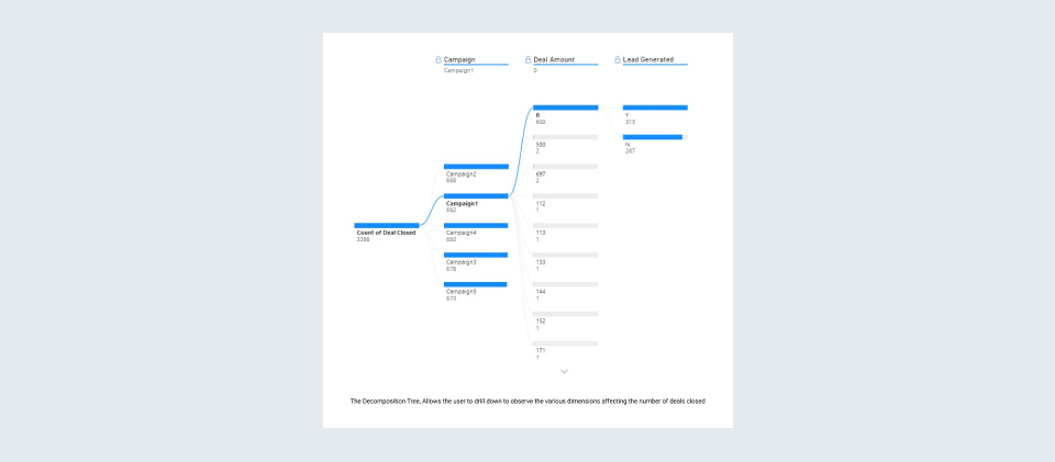
The Decomposition Tree
A highly interactive visual in Power BI, which allows the user to visualize data across multiple dimensions and break down a measure into its various attributes, or drill down to different levels. It is best for ad hoc exploratory analysis, or while performing a “Root cause analysis”.
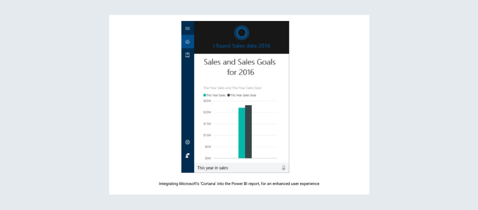
Cortana Integration:
“ Hey, Cortana! ”
Microsoft’s virtual assistant, ‘Cortana’ has been around for a while now, answering our queries, but with the help of Power BI, we can verbally ask questions to our dashboard, and access results and insights by integrating Cortana with our Power BI dashboards.
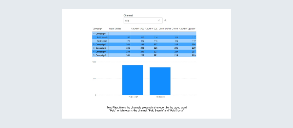
Text Filters and Hierarchy Slicer:
There are various standard filtering methods in Power BI, including, Slicers, Cross filtering from other visuals, and the Filtering Pane. However, most of them require the user to select values from a limited list of values. To simplify this process, and to avoid long DAX / AND-OR logic, Power BI provides certain custom visuals, such as,
- Smart Filter by OkViz
- Text Filter by Microsoft
‘Text Filters’ are powerful slicers, that can be used in Power BI to filter all the report visuals based on the value typed in the filter, the key difference being, that we are filtering the visuals, based on the values present on the report, itself. The conducted search is case-insensitive and displays results for texts with matching substrings to the search input.
Text filters can also be modified with the help of DAX functions such as ‘VALUE’ to take numerical user inputs from users and use those values in various visuals using measures.
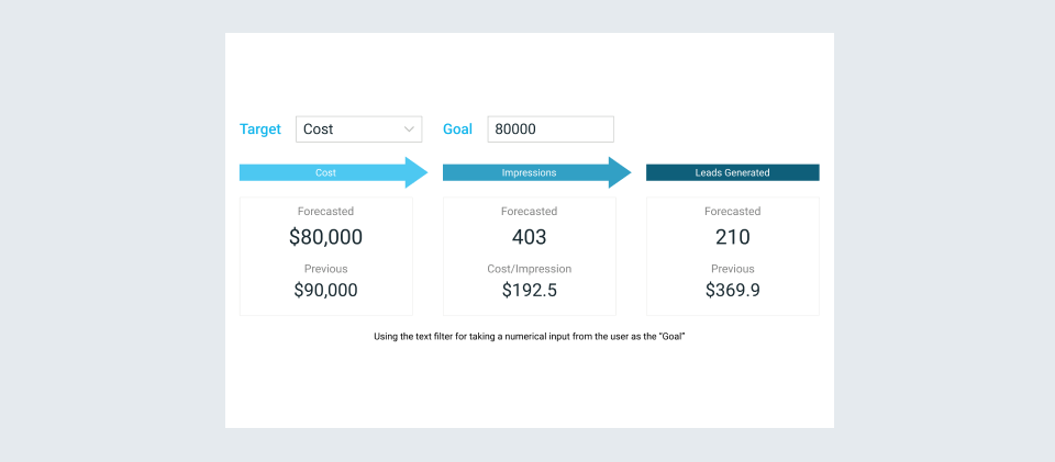
As can be seen in the image, the user gives a number as a string input to the text filter, which is then converted to a number using the ‘VALUE’ function and used in all the other measures accordingly.
Hierarchy Slicer:
Slicers play an important role in any dashboard, giving the user the ability to observe the trends of certain selected values, and dates; giving a filtered view of the dashboards. In extension to the conventional slicer, the ‘Hierarchy Slicer’ has the feature of adding multiple fields to it, and traversing through different levels to select the required item.
With easy formatting, this slicer helps reduce the number of separate slicers used for dimensions present in a hierarchical form.
As can be seen in the figure, using one hierarchy slicer, we can filter the visuals based on the ‘Campaign’, ‘Channel’, and ‘Cohort’.
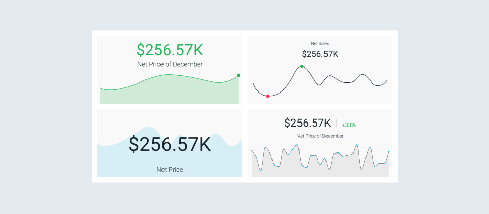
Card with States:
Enhancing the standard built-in card element present in Power BI, the ‘Card with States’ by OKViz, displays the performance of a single measure by using color states, variance/change over other measures, and a trend line.
This visual is especially useful when one wants to compare the performance with respect to a reference value (Current and Previous period analysis), display additional information on the card (the Target), show trendlines, multiple values, or choose from a wide range of card templates.
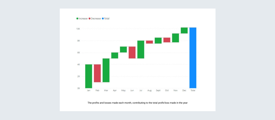
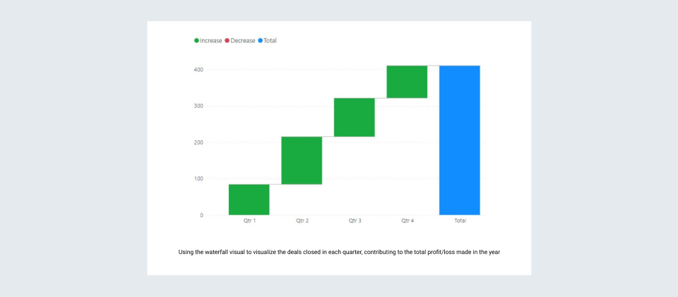
Waterfall Visualization:
The Waterfall visualization represents the positive or negative dip in any measure with respect to time or category points. It shows how the initial value is subjected to positive or negative changes (eg. Quarterly performance), leading up to the final values (eg. Yearly sales).
Some instances wherein Waterfall charts are best used are:
- To observe changes in a certain measure across time, series, or various categories.
- The initial and final Sales/profits for an organization in a year are spread across Quarters / Months, etc.
The visual shows the distribution of the number of deals closed in a year, quarters-wise. Such a representation is best when we wish to express the contribution of each category in the final outcome of a measure/metric.
Similarly, the following visual represents the sales made each month of a year, and their separate contribution to the annual sales.