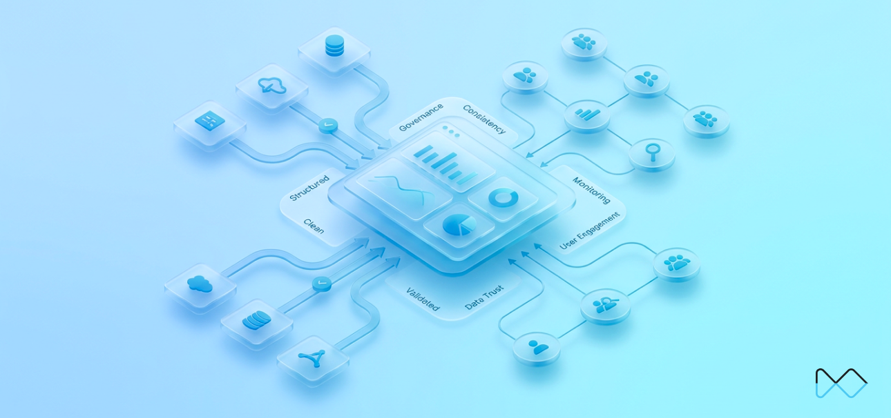
Most Business Intelligence Dashboards fail at two crucial points: first, when their data can't be trusted, and second, when nobody uses them. According to ZoomCharts, only 25–30% of employees use BI and analytics tools regularly. That number hasn't improved much despite years of investment in better tooling and more polished visuals. Possibly, because reliability and adoption are treated as separate problems or, worse, they aren’t treated at all.
Reliability is not an optional quality. It's a structural property built into how requirements are gathered, how queries are validated, and how data pipelines are monitored after launch. And adoption is not a training event. It's the result of smart design decisions, navigation architecture, stakeholder engagement, and ongoing usage tracking.
At NeenOpal, we've formalized across hundreds of BI deployments, spanning Snowflake, BigQuery, Redshift, and Fabric environments. This guide documents the specific BI dashboard best practices we apply across the full dashboard lifecycle to ensure dashboards deliver real business value.
What This Guide Covers
This guide covers two things we've found matter most with business intelligence dashboards: whether the data can be trusted, and whether anyone actually uses them.
- Part 1 is about reliability - the development process, QA checks, SQL validation, data freshness, performance, and security we put in place before anything goes to production.
- Part 2 is about adoption - what we do to make sure dashboards get used after they're built, including user enablement, design decisions, training, stakeholder engagement, and usage tracking.
Part 1: Ensuring Dashboard Reliability – BI Dashboard Best Practices That Actually Work
Reliability is not a feature you add at the end. It is a structural property built in from requirements gathering through production deployment. Here is the framework we apply.
1.1 The 4+1 Step Development Methodology
We use a five-phase process that builds accuracy and traceability into the work from the start, rather than treating them as a final check.
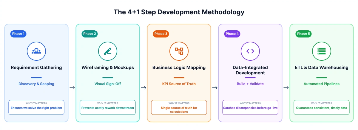
Phase 1: Requirement Gathering
Every project starts with two to three discovery sessions covering data sources, KPI definitions, business context, and reporting grain. Compressing this into a single kickoff call is the most common reason dashboards look good in demos but don't hold up in daily use.
Phase 2: Wireframing and Stakeholder Sign-Off
Before any DAX, Tableau calculated fields, or LookML dimensions are written, we build visual mockups and get explicit sign-off from stakeholders. We use tools like Mokkup.ai, NeenOpal's AI-powered dashboard wireframing product, which lets teams prototype layouts quickly and export directly to Tableau or Power BI.
Phase 3: Business Logic Mapping
Every KPI gets documented, including formula, data source, null-handling logic, and known exclusions. This single source of truth outlives the project. It matters when onboarding a new analyst or running an audit.
Phase 4: Data-Integrated Development
Development and validation run together. After each major join or transformation, we check row counts and key field totals against source systems. Counts go in as inline code comments, so any engineer picking this up later has a clear audit trail to follow.
Phase 5: ETL and Data Warehousing
Automated pipelines on platforms like Snowflake, Google BigQuery, Amazon Redshift, and Microsoft Fabric replace manual refresh entirely. At NeenOpal, connectivity is tested end-to-end before changes go live, so the team knows if something breaks before users notice stale data.
Related Resources:
- Dashboard Development Process
- Mokkup.ai - Our AI-powered dashboard wireframing tool that enables rapid prototype creation without requiring design expertise.
1.2 The BI Checklist: A Four-Phase Quality Assurance Framework
Every business intelligence dashboard we deploy runs through a BI Checklist organized into four phases:
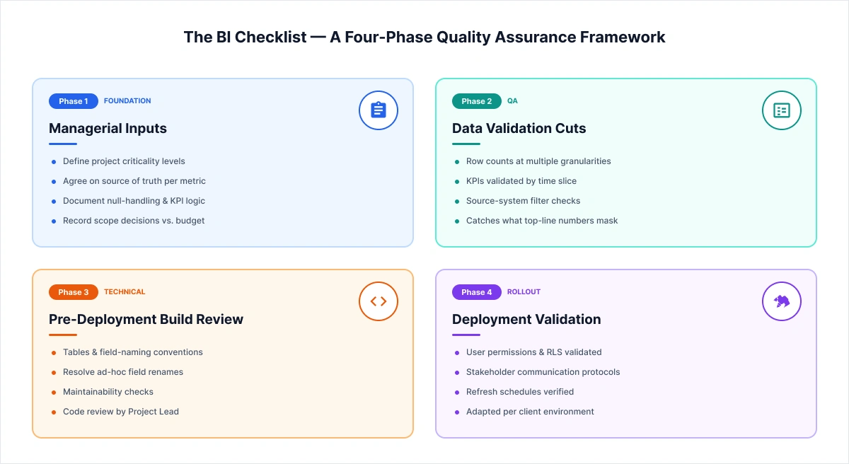
Phase 1: Managerial Inputs (Foundation)
- Define project criticality levels
- Agree on the authoritative source of truth for each metric
- Document null-handling rules and KPI logic
- Record scope decisions based on budget constraints
Phase 2: Data Validation Cuts (QA)
- Check row counts and KPIs at multiple granularities, such as totals, time slices, and source-system filters, because top-line numbers regularly mask what's actually off. We implemented the same in our Snowflake to BigQuery migration across 2,000+ tables, where it caught discrepancies before anything reached production.
Phase 3: Pre-Deployment Build Review (Technical)
- Confirm correct tables and field-naming conventions
- Flag and resolve ad-hoc field renames
- Keep naming consistent so the build stays maintainable over time
Phase 4: Deployment Validation (Rollout)
- Validate user permissions and Row-Level Security
- Confirm stakeholder communication protocols are in place
We adapt this checklist for each client based on what their environment looks like and where things have broken down before.
Related: Complete Business Intelligence (BI) Checklist for Successful Implementation
1.3 SQL & Query Validation
Before any query goes into a business intelligence dashboard, it runs through a structured SQL validation checklist.
Understanding Business Context
- Understand data granularity, unique keys, and whether tables are Type 1 or Type 2
- Verify correct tables, fields, and join conditions, paying close attention to inner vs. left joins.
- Write down any assumptions or business rules used in the query.
Row Count & Total Validation
- After each join, check row counts and key field totals
- Add those counts as inline code comments so there's a record to refer back to
- Any changes to counts or totals need Project Lead approval before moving forward
Null Value Handling
- Identify fields with full or partial null values
- Document the business justification for each
- Get client sign-off on how nulls are handled before the query ships
Safety Checks
- Flag queries that could strain the database or trigger security warnings
- Start development with limited row counts before running against full data
- If a query keeps failing, review it before running it again
This is one of the less visible parts of business intelligence dashboard best practices, but it's where a lot of credibility issues start that cost millions later. Gartner puts the cost of poor data quality at $12.9 million per year for organizations. Something as small as an unreviewed left join that can throw a number off by 3% is enough for stakeholders to lose confidence in everything the dashboard shows.
1.4 Data Freshness and Monitoring
Every business intelligence dashboard we ship includes continuous data health tracking, users shouldn't have to guess whether what they're looking at is current. We handle this through three built-in mechanisms:
|
Feature |
Description |
|
Date Updated Display |
Every dashboard shows when data was last refreshed, with a timestamp sourced from the backend pipeline, not the front-end render |
|
Automated Refresh |
Scheduled ETL processes eliminate all manual refresh dependencies |
|
Failure Alerts |
Immediate email or system alerts triggered when a dashboard refresh fails |
1.5 Performance Optimization
Dashboard performance has a direct impact on adoption. Users who wait more than three seconds for a report to load will route around it. We apply the following optimization standards on every build:
- Visual Limits — A maximum of 8–10 visuals per page to keep rendering fast and reduce cognitive load.
- Data Model Optimization — Star schemas, unnecessary column removal, and relationship pruning to keep the model lean and performant.
- Incremental Refresh — Only new or changed data is reprocessed on each pipeline run, cutting down refresh time significantly.
In Power BI environments, the choice between DirectQuery and Import mode is made based on data freshness requirements and dataset cardinality, not defaulted. This single distinction has multi-second implications on enterprise datasets.
1.6 Security Architecture and Deployment Governance
Access control and deployment structure go into the architecture from day one. Two practices we apply to every build:
|
Practice |
Description |
|
Row-Level Security (RLS) |
Granular data access, users see only data relevant to their role, enforced at the model layer |
|
Separate Environments |
Dev → Test → Prod pipeline keeps changes isolated and validated before anything reaches production |
Part 2: Driving BI Dashboard Adoption — Strategies That Sustain Usage
A technically sound Business Intelligence dashboard with no users delivers no real value. Adoption isn't purely a training or change management issue; it's a design problem, an engagement problem, and an ongoing maintenance problem. These are the BI dashboard adoption strategies that consistently make a difference.
2.1 User Enablement: Building Self-Sufficiency Into the Dashboard Itself
The dashboards that actually get used are the ones that don't require a follow-up email to interpret. Every deployment we work on includes a standard set of the following enablement features for exactly this reason.
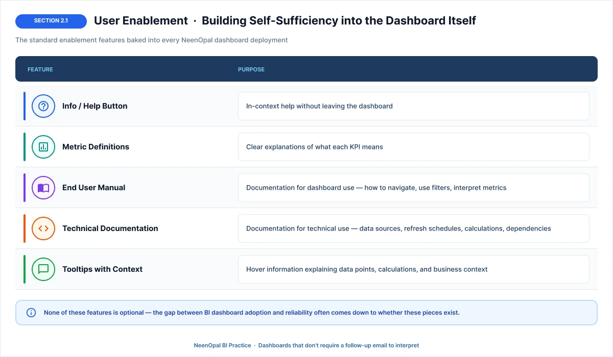
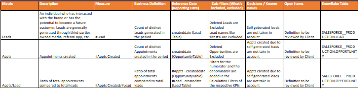
Here are a few samples of our metrics definitions & Info buttons that help users understand exactly what each number means, reducing misinterpretation.
Sample for Metrics definition:
Sample for info button:
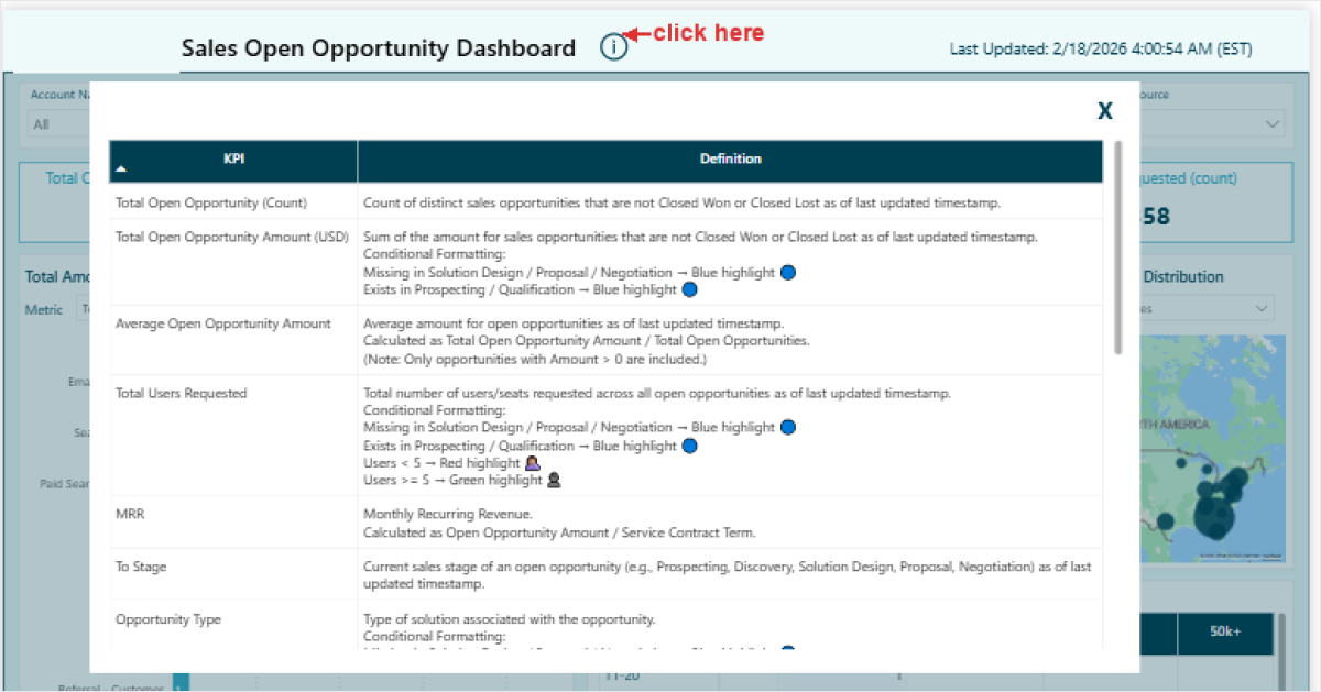
None of these Business Intelligence dashboard strategies is optional as the gap between a BI dashboard adoption and reliability often comes down to whether these pieces exist.
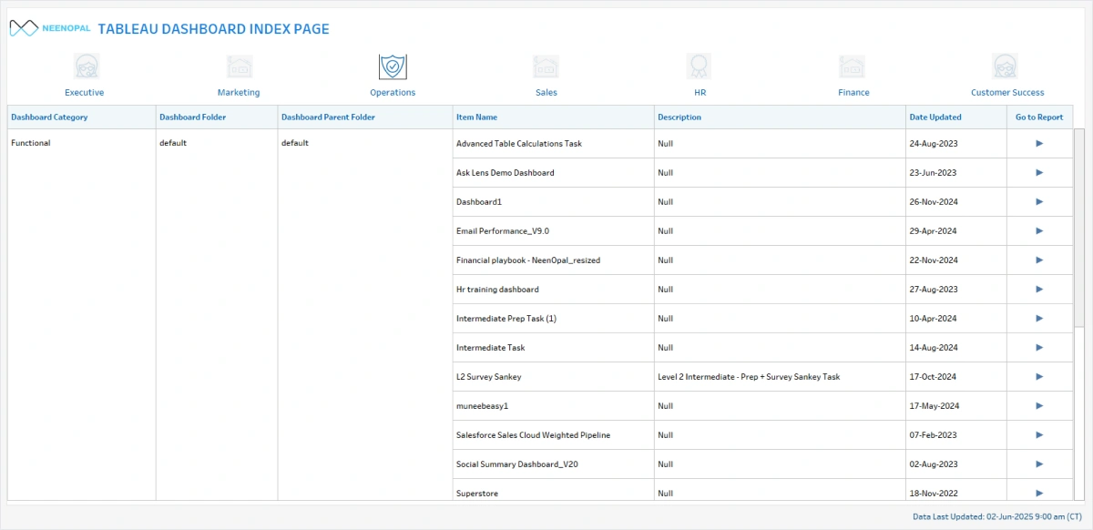
2.2 Navigation Architecture and Information Hierarchy
Poor navigation is another underdiagnosed hurdle on the path to BI dashboard adoption strategies. We address it through three structural design decisions:
- Index Page/ Landing Page: This is a single landing page that catalogs all available dashboards, organized by department, function, and use case. Users can navigate to the right asset without IT intervention.
- Dashboard Categorization: Logical grouping of related dashboards (e.g., Sales Overview, Sales Details, Sales Trends) rather than monolithic reports. Our rule of thumb is one dashboard, one purpose, because when users can predict what a dashboard contains just from its name, they're far more likely to open it consistently.
- Drill-Down Navigation Paths: Hierarchical navigation paths allow users to move from aggregated summaries to granular root-cause analysis within a single session. For example, if a user sees national sales are down, → click to see which region → click to see which city → identifies the problem store
Sample for Index page
2.3 Stakeholder Engagement as a Core BI Dashboard Best Practice
Stakeholder misalignment is one of the more avoidable reasons BI dashboard projects run over or get rebuilt. It usually comes down to a few things: wireframes moving to development without formal sign-off, timelines without clear owners, and a lack of tracking in action items. To approach it, we follow a 4-part BI adoption strategy.
|
Practice |
Description |
|
Stakeholder Sign-Off |
Explicit approval on wireframes before coding |
|
Clear Timelines & Responsibilities |
Define who does what and when |
|
Weekly Status Emails |
Regular updates on project progress and blockers |
|
Action Tracker |
Clear tracking of action items, owners, and deadlines |
2.4 Training & Support: The Underleveraged BI Dashboard Adoption Strategy
A business intelligence dashboard that users do not know how to use gets abandoned fast, regardless of how well-built it is. A structured training combined with always-available self-service material proves an underleveraged BI dashboard adoption strategies for this issue.
- Formal Training — Structured onboarding sessions when users first access dashboards, covering navigation, key metrics, filter usage, and how to interpret the data.
- Self-Service Resources — Video tutorials, step-by-step FAQs, and quick-reference guides users can return to anytime.
Related Resource: BI Dashboard User Manual – A complete self-service reference guide covering user roles, KPI definitions, filters, troubleshooting, and escalation contacts.
2.5 Building Dashboards People Actually Want to Use
Poor design is one of the most common reasons business intelligence dashboards go unused. How information is laid out, who it's designed for, and how visually clean the experience feels all directly influence whether users return. These are the business intelligence dashboard best practices our in-house design team applies on every deployment.
In-House Design Team
Every business intelligence dashboard we build has dedicated design support covering layout and visual hierarchy, color schemes and branding consistency, UX optimization, and accessibility, so the end product is something users actually want to open.
Logical Grouping
Don't cram all visuals into a single report. Group charts that logically belong together, and build separate dashboards for separate purposes.
|
Bad Practice |
Good Practice |
|
30 charts on one page |
Sales Overview (7 charts) + Sales Details (8 charts) + Sales Trends (6 charts) |
|
Everything for everyone |
Executive Summary vs. Analyst Deep-Dive |
Audience-Specific Design
Another effective bi dashboard adoption strategy is designing for the person opening the dashboard. Different audiences need fundamentally different views of the same data. This is why we enable role-based access control (RBAC) so user only sees data relevant to their responsibility level.
- Executives — High-level KPIs, trends, and exceptions only
- Managers — Departmental details, comparisons, and drill-downs
- Analysts — Granular data, filters, and export capabilities
Visual Best Practices
Good dashboards don't just display data, they guide the eye. We follow three core principles to make sure every visual earns its place on the page.
- Less is More — 5–7 key metrics per dashboard view; additional detail lives one click deeper
- Inverted Pyramid — Most important KPIs sit top-left, the natural visual anchor point
- Conditional Highlighting — Red/yellow/green status formatting for instant performance assessment
2.6 Data Storytelling: Structuring Business Intelligence Dashboards to Drive Action
Business Intelligence dashboards that just display numbers don't drive action. They need to provide people with context to know what to do with the information they are seeing. This is where the right storytelling saves the day.
We structure every dashboard around a four-stage flow:
- Overview → What's the big picture across the period?
- Trends → What is changing, and in which direction?
- Details → Where specifically is performance diverging?
- Actions → What does the data suggest doing next?
A practical example of this in action: Revenue is down 5% → Decline started in Q3 → Concentrated in the West region → Investigate the West region sales team
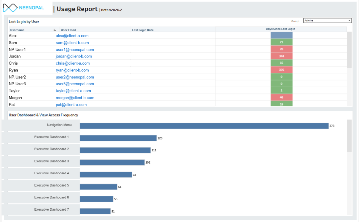
2.7 Usage Tracking: Measuring Adoption to Improve It
You cannot optimize what you do not measure. We create a dedicated usage tracking dashboard for every BI deployment, consisting of two key bi dashboard adoption strategies:
|
Practice |
Description |
|
Usage Dashboard |
We create a dedicated dashboard to track dashboard usage, who's using it, how often, which pages are visited |
|
Usage Pattern Analysis |
Understand how users interact with dashboards to identify improvement opportunities |
Sample Tableau Usage Report
Going Beyond Requirements: What Sets NeenOpal Apart
We go beyond requirements. We understand what businesses really need.
The technical execution described above represents the necessary baseline. Many can follow BI dashboard best practices and deliver something that works. What separates our transformative BI implementations from adequate ones is the discipline of proactive value delivery, anticipating what business users will need even when they haven't specified. We add geography filters, date ranges, comparisons, conditional highlighting, and drill-downs, because that's what business users need, even if they didn't think to ask.
The result: Dashboards that are complete from day one. No back-and-forth for "obvious" features.
Our Key Differentiator: Understanding Business Needs
We don't just implement what's asked. We proactively add value based on our expertise. Clients get MORE than they asked for. This is what sets us apart. We think like business users and anticipate what they will need, even if they didn't specify it.
|
What Client Asked |
What We Delivered |
Why We Did It |
|
"Sales dashboard" |
Added geography filter, date range, product category filters |
Users always need to slice data, obvious requirement |
|
"5 KPIs for customer score" |
Added weighted average for overall customer score |
Single actionable metric alongside details |
|
"Inventory report" |
Built revenue impact view showing lost sales from stock-outs |
Business impact matters more than raw inventory counts |
|
"Performance metrics" |
Added YoY, MoM, vs Target comparisons |
Numbers without context are meaningless |
|
"Basic dashboard" |
Added red/yellow/green conditional highlighting |
Instant visual status without interpretation |
|
Didn't ask for drill-down |
Added Region → Country → City → Store navigation |
Users naturally want to investigate deeper |
None of this came from the brief. It came from knowing what gets asked for in the second meeting.
Real Examples of How We Apply Our Own Mind
|
Category |
What We Add |
Why |
|
Filters |
Date range, geography, product category; display selected filters on dashboard |
Users always need to slice data and know what's filtered |
|
Comparisons |
YoY, MoM, vs Target, vs Budget, trend lines |
Raw numbers are meaningless without context |
|
Calculations |
Weighted averages, growth rates, rankings, % of total |
Actionable insights, not just raw numbers |
|
Visual Cues |
Red/yellow/green status, exception flags, trend arrows |
Instant visual understanding |
|
Navigation |
Drill-down paths, back buttons, bookmarks |
Users explore without asking for changes |
|
Context |
Tooltips explaining metrics, data source info |
Self-service understanding |
Business Intelligence Dashboards That Deliver
Reliability and adoption aren't separate workstreams. They're two sides of the same problem because both outcomes mean the same thing: wasted investment in business intelligence dashboards. Everything covered in this guide comes from work we've actually done across hundreds of deployments. None of it is theoretical. The organizations that consistently get value from their BI investments treat BI dashboard best practices not as a checklist to complete at launch, but as an operating standard to maintain afterward. If your team is building, auditing, or scaling a BI environment, NeenOpal's team has the technical and business depth to help you do it right.
If you're dealing with low adoption or unreliable data in your dashboards, let's talk. We've solved this across 100+ deployments.
Frequently Asked Questions
1. What is the most important factor in ensuring business intelligence dashboard reliability?
The single most important factor is establishing a documented data validation framework across all pipeline stages from source system extraction through the semantic model layer to front-end rendering.
2. How do you measure Business Intelligence dashboard adoption rates?
We track adoption through a dedicated usage dashboard built directly into the BI environment. It captures who's logging in, how often, which pages they're visiting, whether they're interacting with filters, and whether they're exporting data.
3. What are the best BI dashboard design practices for executive audiences?
Executive dashboards should prioritize: 5–7 high-level KPIs with period-over-period context (YoY, MoM, vs. Target), minimal visual density (8–10 visuals maximum per page), and narrative elements that contextualize performance variance. Executives need signals, not spreadsheets.
4. How does Row-Level Security affect dashboard adoption?
RLS, when implemented correctly at the semantic model layer (rather than the report layer), enables organization-wide dashboard sharing without data access risk, which is one of the most significant deployment accelerators available. Users can receive a single dashboard link regardless of their role. Only the data they see is automatically scoped to their authorization context.
5. Which BI tools support the best practices described in this guide?
The methodology described here has been applied across Tableau, Microsoft Power BI, Looker (Google Cloud), Qlik Sense, and AWS QuickSight deployments. Data pipeline infrastructure has included Snowflake, Google BigQuery, Amazon Redshift, Databricks, Azure Synapse Analytics, and Microsoft Fabric.